
Documentation
Grid Builder Pro
Version 3.4.0 · updated November 18, 2026
Overview
With Grid Builder Pro you build your own layout blocks (“grids”) for Shopware Shopping Experiences – without code. You decide how many columns and rows a grid has and where each element sits, separately for mobile, tablet, laptop and desktop (optionally also Desktop XL and Desktop XXL). The finished grid appears in Shopping Experiences as a regular block that you fill with images, texts, product boxes or other elements as usual.
Who is it for? Anyone who designs home pages, category entry pages, lookbooks or campaign pages and hits the limits of Shopware’s standard blocks.
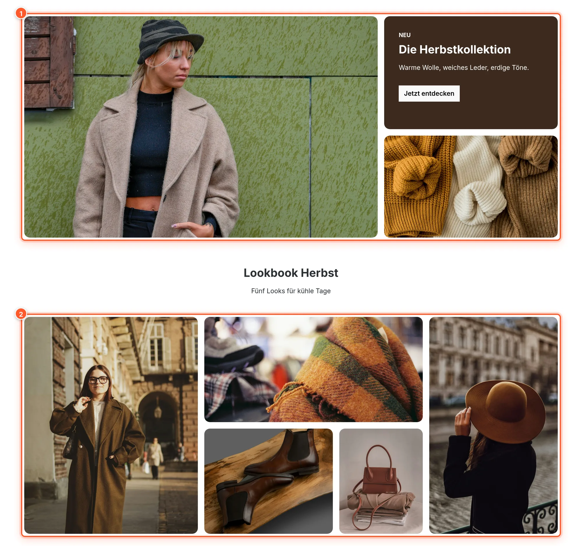
You’ll find the plugin in the Administration under Content › CMS Grid Builder. It requires Shopware 6.7.
What’s included:
- Grid editor for drawing, resizing and swapping elements, with live preview
- Separate layout per viewport (mobile to Desktop XXL), elements can be hidden per viewport
- Eight starter presets in the editor and eight ready-made grids right after installation
- Template library with fully designed sections including images and texts (from 3.4.0) – you can browse all templates in advance in the template gallery
- Slot style per grid cell: padding, background color, background image, border radius, minimum height, vertical alignment
- Export / import of grids as JSON, duplicating, usage overview
- Optional: AI grid generator from a screenshot, sketch or text (paid in-app unlock)
Setup
- Install and activate the plugin via Extensions › My extensions.
- If your shop doesn’t have any grids yet, the plugin automatically creates eight ready-made grids on installation (“Hero + 3 Teasers”, “Feature Left”, “50 / 50 Split”, “3 Columns”, “Mosaic Gallery”, “Main + Sidebar”, “Banner + 4 Tiles”, “2 × 2 Tiles”). The names appear in your shop’s system language (German or English).
- Open a Shopping Experience under Content › Shopping Experiences, choose the GRID BUILDER PRO category in the block selection and drag a grid onto the page (see Using grids in Shopping Experiences).
- In each grid cell, click “Click here to replace this placeholder!” and choose the element you want (e.g. image or text). Save the layout and assign it to a category, landing page or shop page as usual.
That’s it – the grid is displayed responsively in the storefront. No configuration is needed; the plugin takes the breakpoints from your theme (see Settings).
Empty placeholder elements aren’t shown in the storefront – the cell simply stays empty. So replace every placeholder you want to see.
Managing grids
Under Content › CMS Grid Builder you see all grids in your shop.
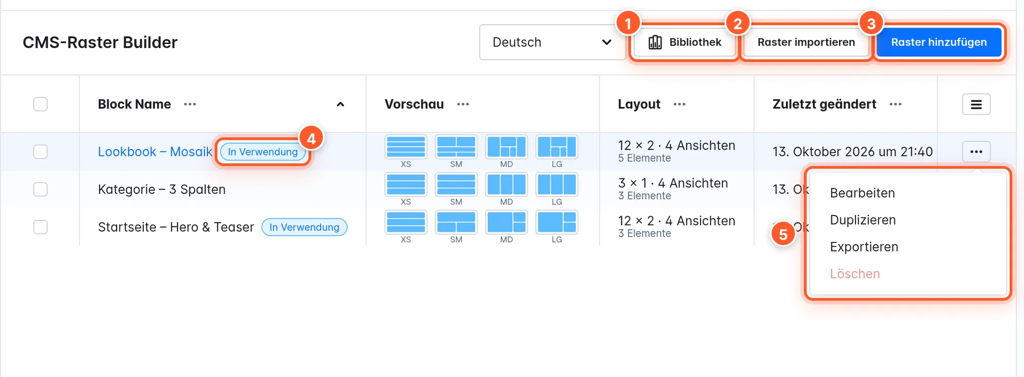
- The Preview column shows a mini preview per viewport (XS = mobile, SM = tablet, MD = laptop, LG = desktop, possibly XL/XXL). Layout summarizes the desktop view’s columns × rows, the number of viewports and the number of elements.
- In use 4 marks grids that are placed in at least one Shopping Experience. Such grids can’t be deleted.
- Double-click a row to rename a grid directly in the list.
- Via the context menu 5 you duplicate a grid (creating “… Copy”) or export it as a JSON file. With Import Grid 2 you read such a file back in in another shop; invalid files are rejected.
- Library 1 opens the template library in “Grid only” mode (see Template library).
Creating a grid
Click Add Grid. At the top of the page you’ll find two shortcuts:
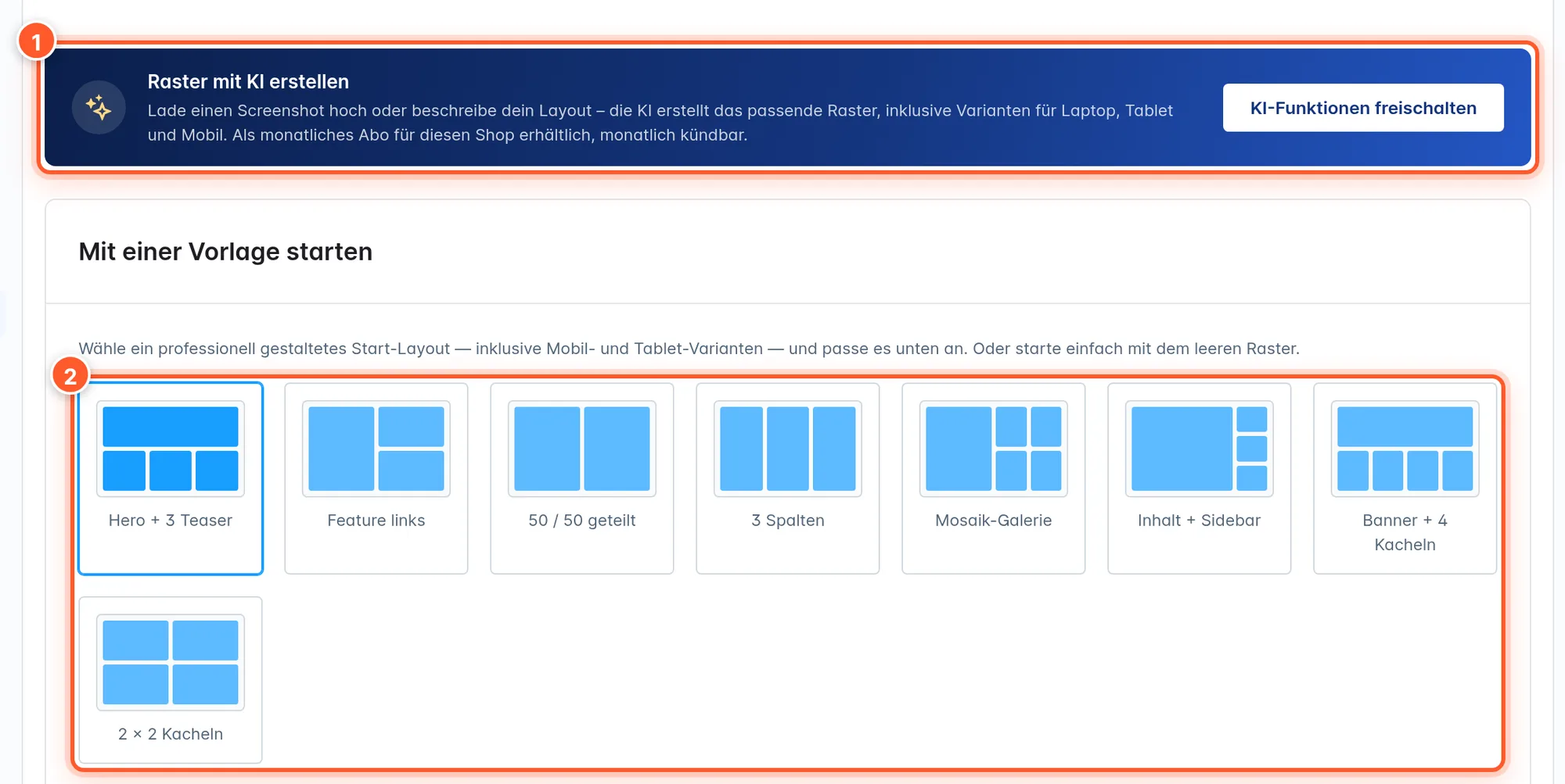
- Start with a template 2: a click on one of the eight starter presets takes over its layout including the mobile, tablet, laptop and desktop variants. You can adjust everything afterwards. Alternatively, start with the empty grid.
- If the AI generator is unlocked, the Generate grid with AI card appears instead of the note 1 (see AI grid generator).
Below that comes the General card with the grid’s basic settings:
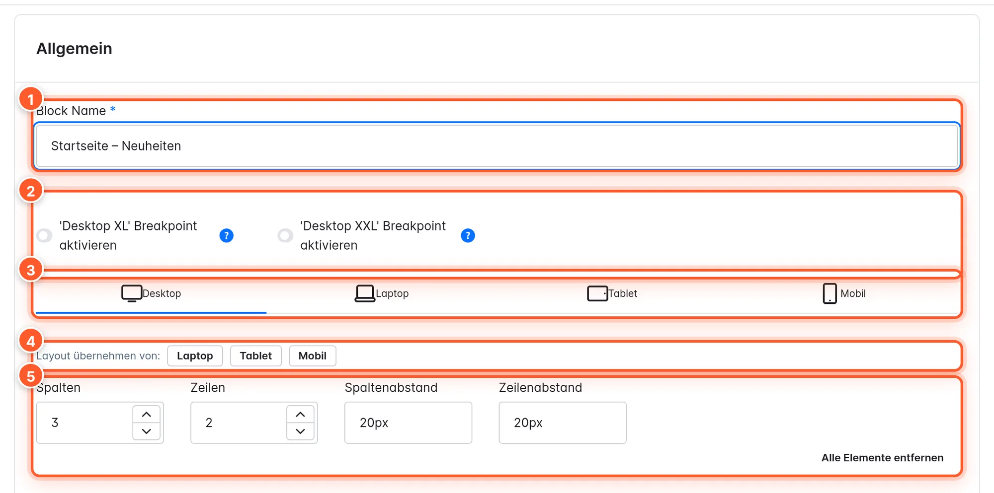
- Block Name 1 – the name under which you’ll find the grid in the Shopping Experience block selection.
- Activate ‘Desktop XL’ / ‘Desktop XXL’ breakpoint 2 – unlocks additional viewports for very wide screens if your theme supports these breakpoints. A newly activated viewport starts as a copy of the desktop view.
- Viewport tabs 3 – Desktop, Laptop, Tablet, Mobile (and possibly XL/XXL). Each viewport has its own grid.
- Copy layout from: 4 – copies columns, rows, gaps and element positions from another viewport into the current one. Ideal for creating the laptop view from desktop, for example, and then just fine-tuning it.
- Columns, Rows, Column gap, Row gap 5 – only apply to the current viewport. Gaps are whole numbers with a CSS unit (
px,%,rem,em,vw,vh…) or0. Remove all elements clears the current viewport.
Save with Save (or Ctrl/Cmd + S). A new grid is created on the first save and then opens as a detail page.
Drawing elements
In the grid editor, you see the current viewport’s cells as a grid.
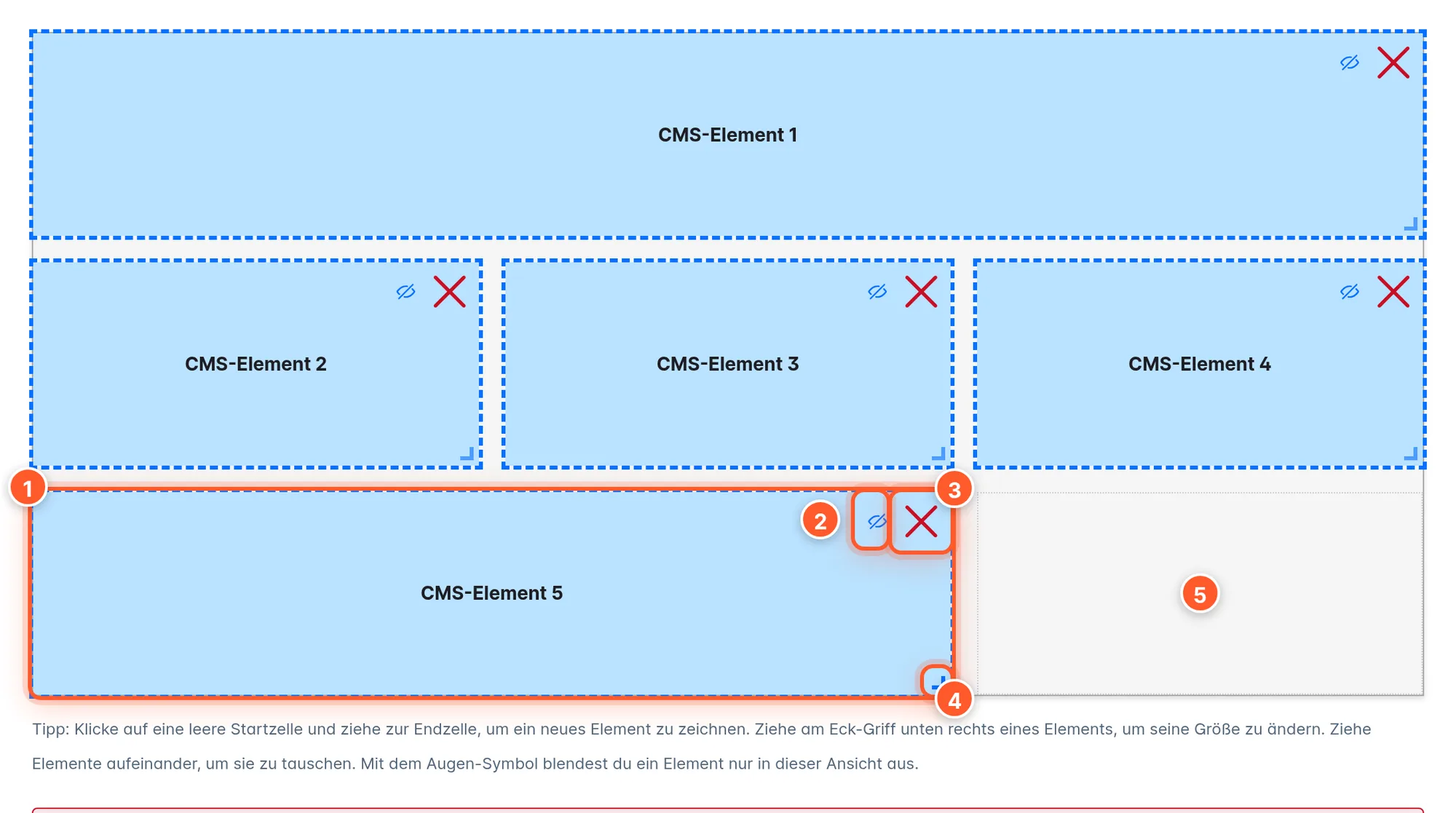
- Draw: Click an empty start cell 5, hold the mouse button and drag to the end cell. The new element 1 spans all cells in between – across several rows too.
- Resize: Drag the corner handle 4 at the bottom right. The size snaps cell by cell, down to 1 × 1. The top left corner stays fixed.
- Swap: Drag one element onto another – they swap positions.
- Hide 2 and Remove 3: see below.
How elements and content are connected
An element’s number (“CMS Element 1”, “CMS Element 2” …) is the link to the content: CMS Element 1 is the same content in every viewport, just in a different position. That means:
- All viewports must contain the same number of elements. Otherwise a warning appears and the grid can’t be saved.
- Remove 3 deletes the element in this viewport and shifts the numbers of all following elements. If you only want to hide content on one device, use Hide 2 instead.
- The order in which you draw elements determines their number. So draw in the same order in each viewport, or use Copy layout from: as a starting point.
If you reduce Columns or Rows, elements that extend beyond the new edge are immediately removed from the viewport. Check the element count afterwards.
Responsive viewports
Switch to another viewport via the tabs and rearrange the elements there – for example, all elements stacked in one column on phones.
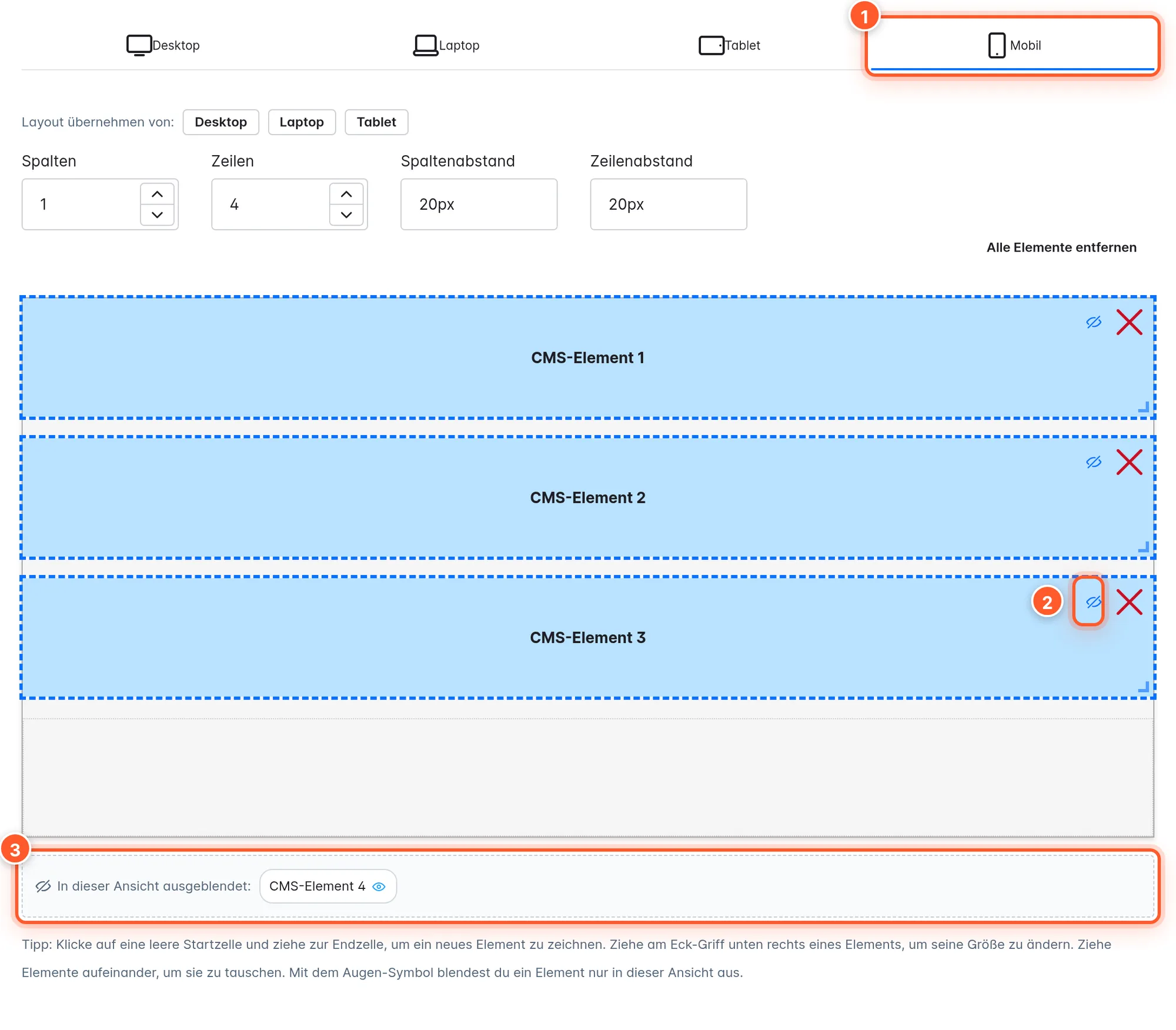
- Hide per viewport: The eye icon 2 hides an element on this viewport only. It then appears in the Hidden on this viewport: bar 3 and isn’t shown in the preview or storefront. The element count stays the same.
- Show again: Click the eye next to the element in the bar. It’s placed in the first cell at the top left – then drag it to the right spot or resize it.
- Which viewport applies when? Each viewport applies from its minimum width upwards until the next one takes over: Mobile from 0 px, Tablet from 576 px, Laptop from 768 px, Desktop from 992 px, Desktop XL from 1200 px, Desktop XXL from 1400 px (Bootstrap default; adjustable under Settings). Without an activated XL/XXL viewport, the desktop view also applies on very wide screens.
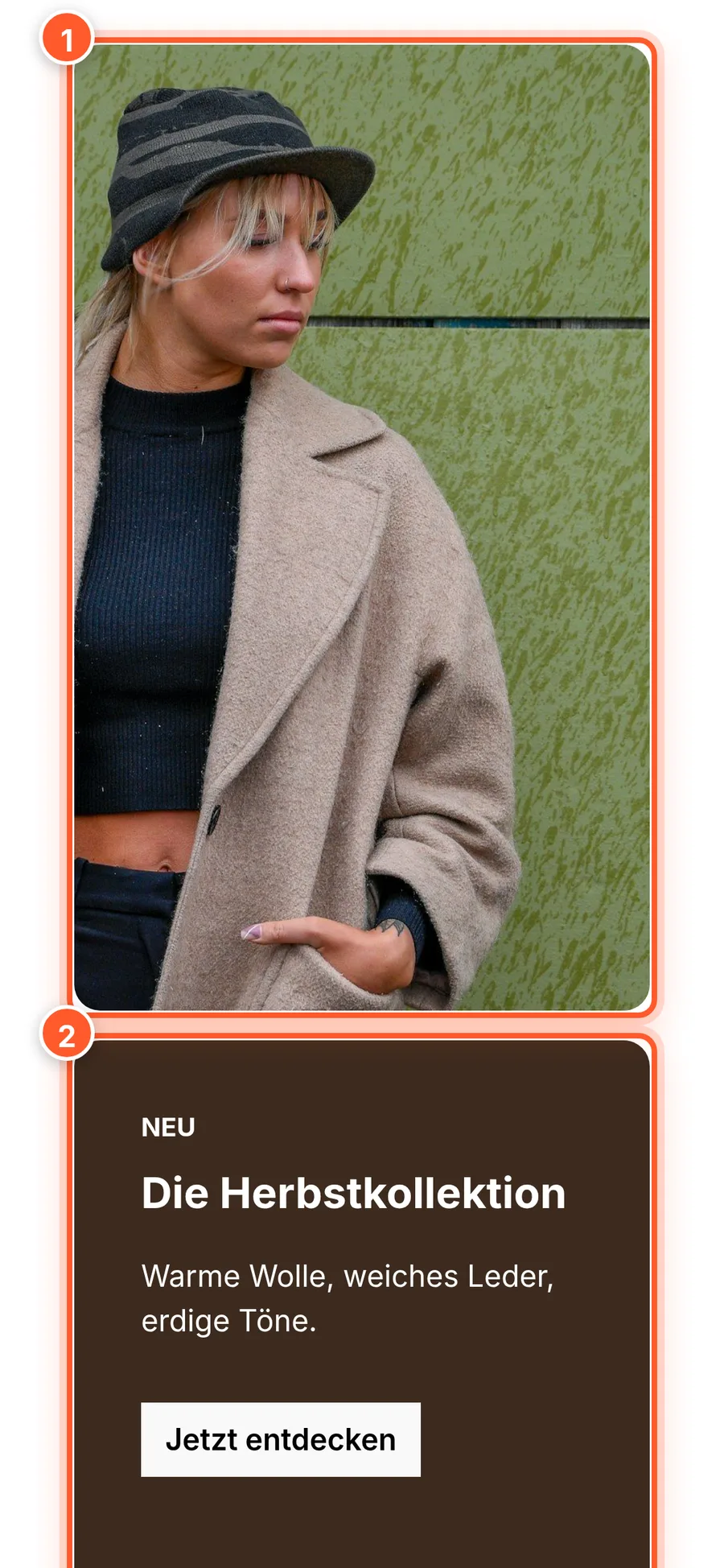
Default elements and live preview
Below the editor you’ll find two more cards:
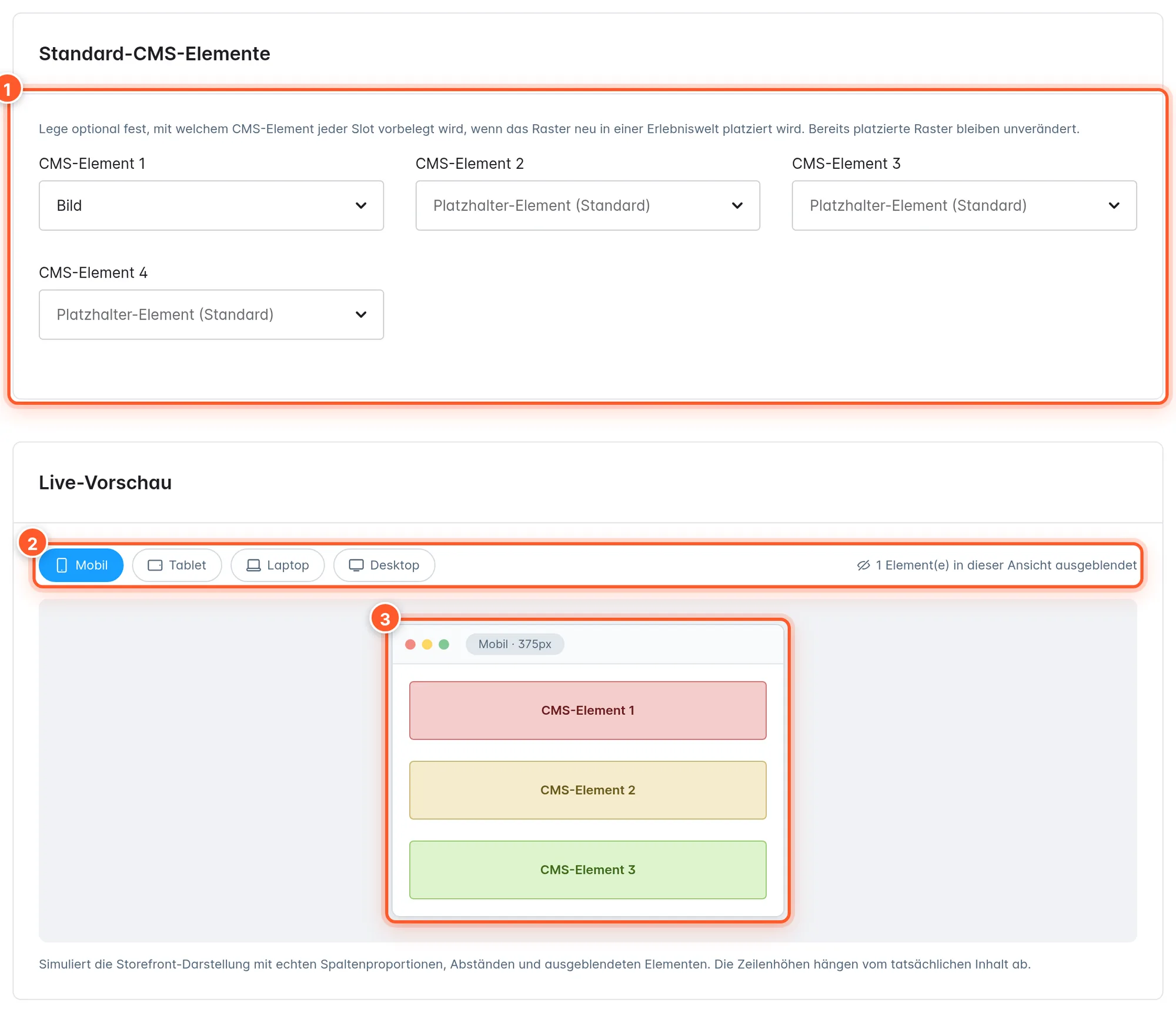
- Default CMS elements 1: optionally set which element each slot is pre-filled with when the grid is newly placed in a Shopping Experience – e.g. slot 1 = image, slot 2 = text. If left empty, it’s the Placeholder element (default). Grids that are already placed stay unchanged.
- Live preview 23: simulates the storefront with the real column proportions and gaps at a typical device width (Mobile 375 px, Tablet 640 px, Laptop 820 px, Desktop 1140 px, XL 1320 px, XXL 1600 px). Hidden elements are missing, and a note counts them. The preview updates instantly with every change. Row heights in the storefront result from the actual content – so the preview only shows them schematically.
Using grids in Shopping Experiences
Open a Shopping Experience and click Blocks in the right sidebar. The GRID BUILDER PRO block category is always at the very top of the selection – even if no grid exists yet.
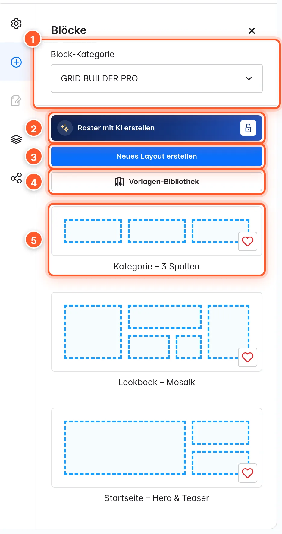
- Place a grid: Drag a grid 5 onto the page like any other block. Each cell initially contains the placeholder (or the configured default element).
- Create new layout 3 opens the full grid editor in a window – with starter presets, AI generator and live preview. After saving, the new grid is available in the block list right away, without leaving the Shopping Experience.
- Template library 4 inserts a fully designed section (see Template library).
- Check responsiveness: Use the device icons at the top of the Shopping Experience to switch the preview. The grids follow the view (Mobile → mobile grid, Tablet → tablet grid, Laptop → laptop grid, Desktop → desktop grid).
Editing the grid layout from the Shopping Experience
Select a placed grid block. In the block settings you’ll find the Edit grid layout button:
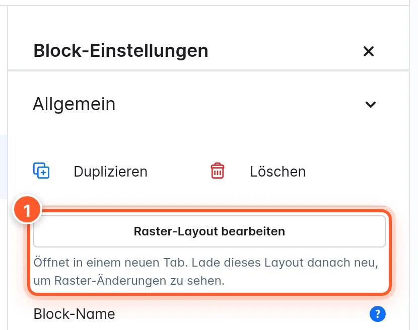
The grid opens in a new tab so your unsaved changes to the Shopping Experience are kept. Reload the Shopping Experience after saving the grid to see the changes.
Where grids work
Grids work in all layout types (landing page, shop page, listing page, product page), in the layout tab of categories, products and landing pages (where you edit the cell content as usual), and on blog pages of the SAS Blog plugin.
Slot style
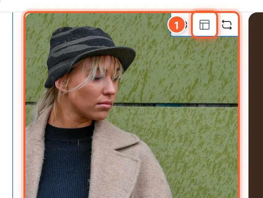
Every grid cell (“slot”) can get its own styling – without CSS. In the Shopping Experience, hover over a cell of a Grid Builder grid and click the Slot style icon:
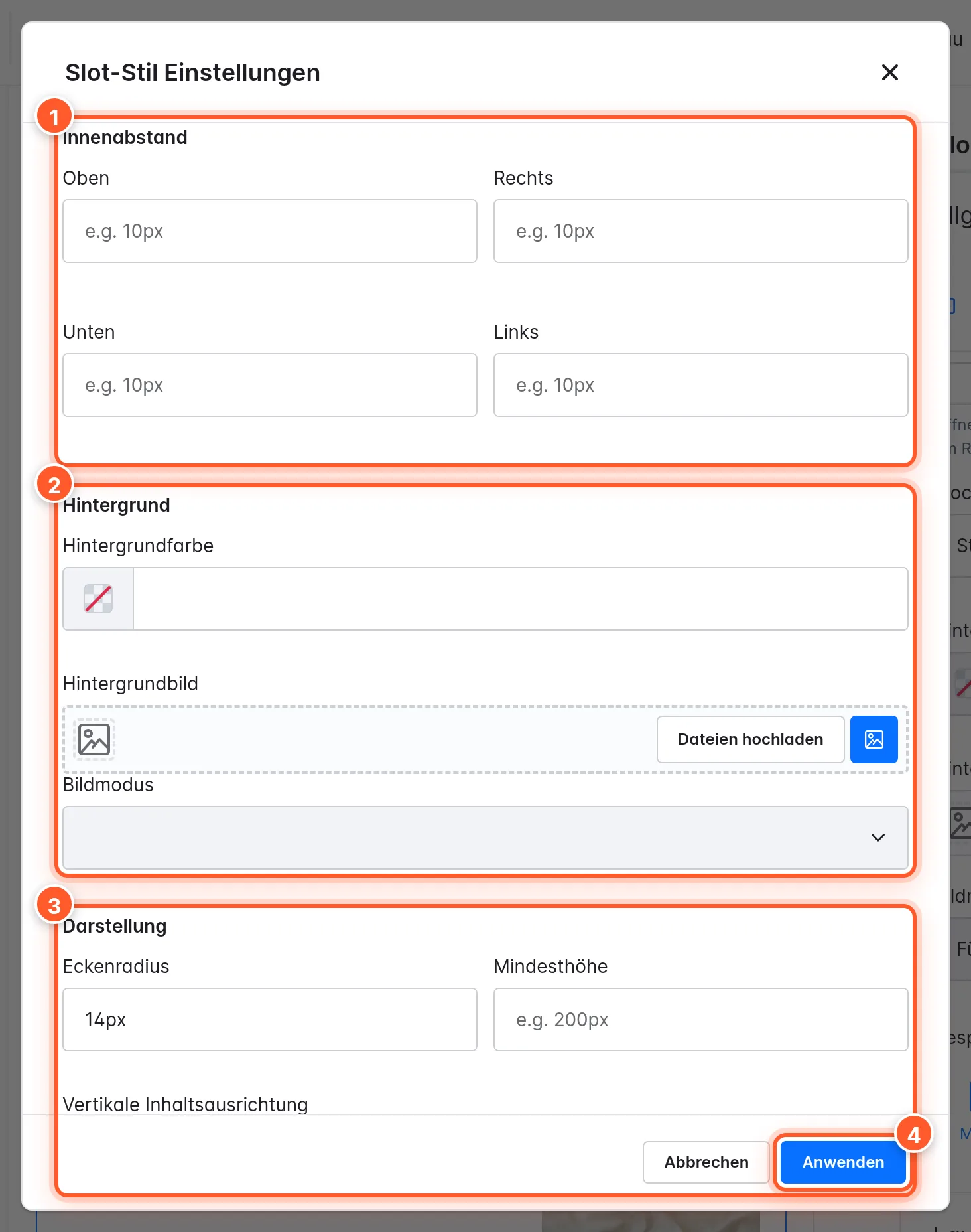
| Setting | Effect |
|---|---|
| Padding (Top, Right, Bottom, Left) | Space between the cell edge and the content, any CSS value, e.g. 24px or 2rem |
| Background Color | Color of the cell (color picker) |
| Background image | Image behind the content; upload it or choose it from the media |
| Image mode | Cover (default, image covers the cell), Contain (whole image visible), Auto (original size) |
| Border radius | Rounded corners, e.g. 12px; overflowing content is clipped |
| Minimum height | The cell is at least this tall, e.g. 320px |
| Vertical content alignment | Default, Top, Center, Bottom – e.g. text centered on a background image |
Apply takes over the values; they’re saved together with the Shopping Experience. The slot style applies to this one placement of the grid (not to all Shopping Experiences using the grid) and is the same for all viewports. The admin preview and the storefront both show it.
Template library
From version 3.4.0, Grid Builder Pro includes a library of fully designed sections – home page heroes, category entry points, brand & story, USP bars, lookbooks, product highlights, image & text, newsletter and campaigns (Black Week, Cyber Monday, Christmas, winter sale). Each template brings its grid, the elements with placeholder images and texts (German and English) and the slot styles. Colors and buttons follow your theme. New templates are added continuously, without a plugin update. You can browse all templates in advance in the template gallery.
How to open the library:
- When adding a section: In the Shopping Experience, click the plus to add a section and, next to “Sidebar” and “Full width”, choose the Insert from library tile. The template lands exactly at that spot.
- Via the block selection: The Template library button in the GRID BUILDER PRO category inserts the template after the currently selected section (or after the section of the selected block), otherwise at the end of the layout.
- Grid only: Library in the grid list takes over only a template’s grid with Use grid only – without content, images and styling.
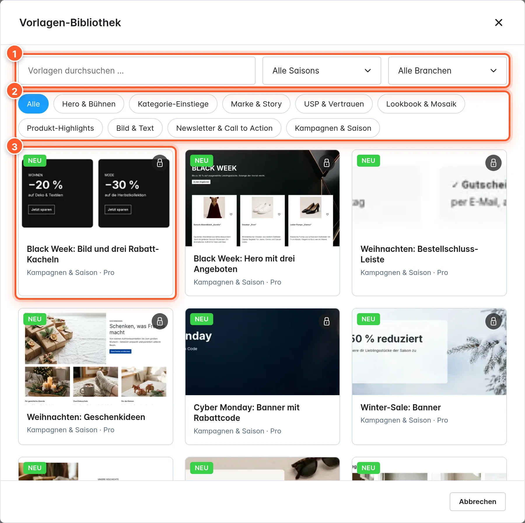
- Search and filter 12: The search covers titles and keywords. Next to it you filter by season and industry (Fashion, Home & living, Food, Beauty, Electronics, Sports, All industries). A second click on an active category removes the filter again.
- Sorting and “New”: Seasonally highlighted templates come first, then the newest. The New badge marks templates added since your last visit to the library (on your first visit: from the last 30 days).
- Pro templates 3: The seasonal campaign templates are marked with Pro and a lock. They’re part of the AI Generator & Templates subscription – the same in-app unlock as the AI grid generator. In the detail view you book it via Unlock; the library then reloads and the template is usable right away.
A click on a template opens the detail view:
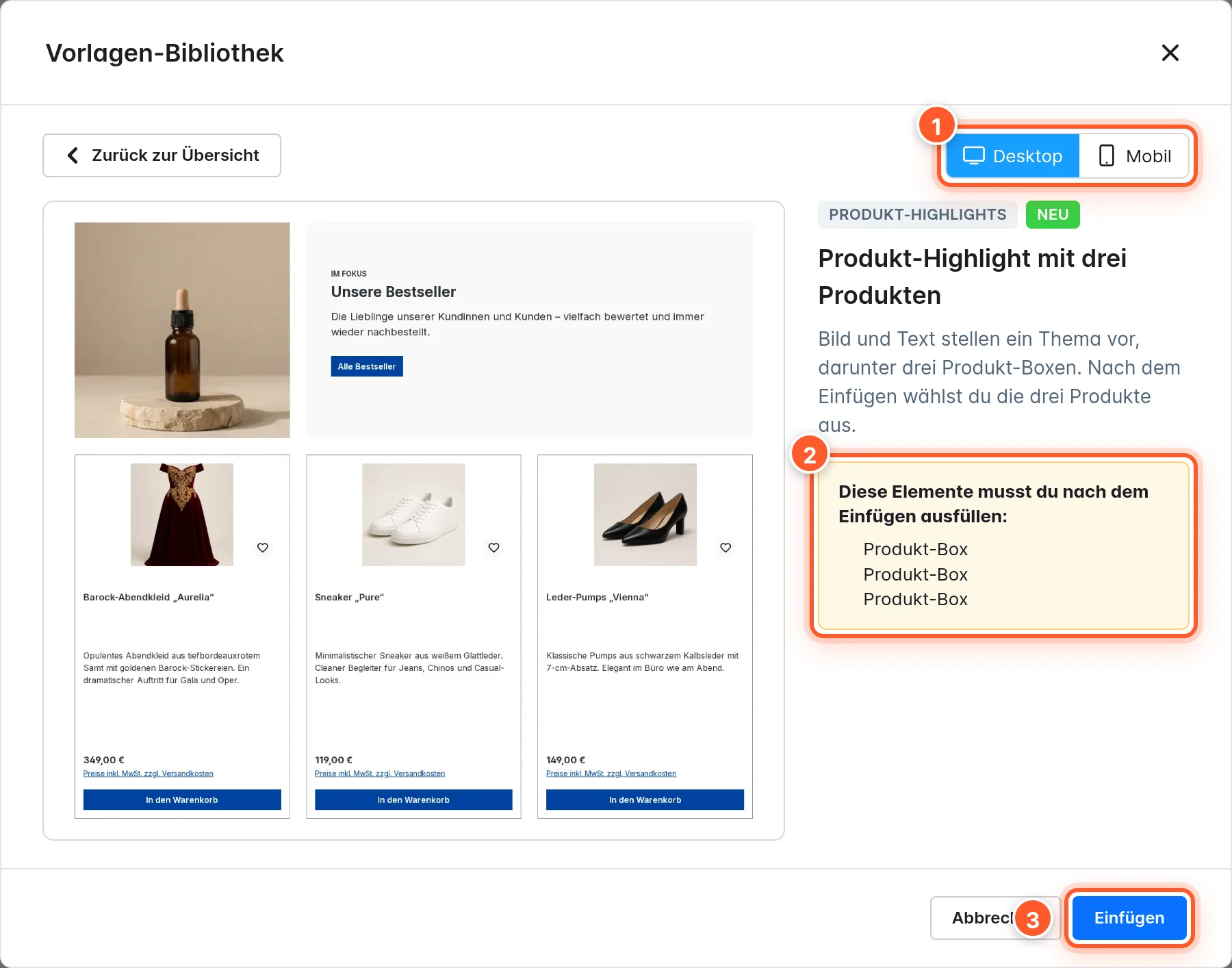
Click Insert 3. The library creates the grid, imports the images and puts the section into the layout. After that:
- Nothing is saved yet. Check the section, replace images and texts, and save the layout as usual.
- Elements you need to fill in (e.g. product boxes without a product) are marked Please fill in in the editor. The marker disappears as soon as you edit the element.
- Grids and images are only created once (images in the Shopping Experiences media folder) and reused the next time you insert. If an identical grid already exists, no new one is created. If you’ve since changed an adopted grid, the library creates a new one instead of overwriting yours.
- If an element of the template doesn’t exist in your shop, it’s replaced by a placeholder and you get a notice.
You can only insert templates in the system default language and in layouts that aren’t locked (in other languages the button is disabled). The texts appear in the language you’re currently editing the Shopping Experience in – if the template doesn’t have it, English, then German.
Privacy: For the library, your shop fetches the catalog, the templates and their images from apps.flinkfactory.com; your browser loads the preview images in the Administration directly from there. Only the Shopware and plugin versions, the Administration language and – if present – your shop’s in-app purchase token (used to verify the unlock) are transferred. Your shop’s content isn’t transferred. The server doesn’t store shop identifiers, only how often each template was fetched.
AI grid generator
The AI generator creates a grid from an image and/or a description – including variants for laptop, tablet and mobile.
How to get it: The generator is a paid in-app unlock for the respective shop (“AI Generator & Templates subscription”), cancelable monthly. You book it via Unlock AI features in the note when creating a grid (see the image in Creating a grid) or via the lock icon in the Shopping Experience block selection. Requirement: your shop is connected to the Shopware Store. The same subscription unlocks the Pro templates in the template library. Without the unlock, the full rest of the feature set stays available.
How to use it:
- Click Add Grid (or Create new layout in the Shopping Experience). After unlocking, the Generate grid with AI card appears there.
- Drag a screenshot or sketch of the layout you want into the upload field (PNG, JPG or WebP, max. 5 MB) and/or describe it in the Layout description field (max. 4,000 characters), e.g. “Large full-width hero banner at the top, three equally wide teasers below”. A text description alone is enough.
- Click Generate grid. The analysis takes up to a minute.
- The result is taken over into the editor (Desktop, Laptop, Tablet, Mobile; activated XL/XXL viewports get a copy of the desktop view). Check all viewports, adjust them and save.
Not quite what you wanted? Simply generate again – the results vary from run to run – or add a more precise description or a clearer image.
Privacy: The image and description are sent to apps.flinkfactory.com for analysis, together with your shop’s in-app purchase token and the Shopware version.
Settings
The plugin configuration (Extensions › My extensions › Grid Builder Pro › Configure) only contains the Developer Settings - Responsive Breakpoints card. Here you set from which width (in pixels) each viewport applies. If you leave a field empty, the plugin uses the breakpoint from your theme, otherwise the Bootstrap default.
| Setting | Viewport | Default |
|---|---|---|
| Breakpoint XS in px (Mobile devices) | Mobile | 0 |
| Breakpoint SM in px (Tablet) | Tablet | 576 |
| Breakpoint MD in px (Laptop) | Laptop | 768 |
| Breakpoint LG in px (Desktop) | Desktop | 992 |
| Breakpoint XL in px (XL Desktop) | Desktop XL (only if activated in the grid) | 1200 |
| Breakpoint XXL in px (XXL Desktop) | Desktop XXL (only if activated in the grid) | 1400 |
The settings can be set per sales channel. Only change them if your theme uses different breakpoints than Bootstrap.
Per grid (in the General card): Block Name, Activate ‘Desktop XL’ breakpoint, Activate ‘Desktop XXL’ breakpoint; per viewport Columns, Rows, Column gap, Row gap; per slot optionally a default CMS element.
Tips & hidden features
- Live changes: Placed grids are linked to the grid, not copied. If you change a grid, all Shopping Experiences using it change immediately. The detail page warns you about this and links directly to clearing cache necessary.
- Used on layouts: A grid’s detail page lists all Shopping Experiences it’s used in – with layout type (landing page, shop page, listing page, product page) and count if it appears several times. A click opens the Shopping Experience.

- One grid, many looks: Because the slot style applies per placement, you can use the same grid several times – once with dark tiles, once with light ones. For a slightly different split, duplicate the grid in the list.
- Reuse grids across shops: Export a grid as JSON and import it in your staging or second shop. Name, viewports and element positions are exported.
- Responsive in no time: Build the desktop view first, then click Copy layout from: Desktop in Laptop/Tablet/Mobile and just rearrange – that way the element numbers stay the same everywhere.
- One column on mobile: For simple stacks, set Columns to 1, Rows to the number of elements and draw each element into one row.
- Text on an image: Background image via slot style, image mode Cover, Minimum height e.g.
400px, Vertical content alignment Center – and a text element in the cell. - Keyboard: On the grid detail page, Ctrl/Cmd + S saves; Esc cancels.
- Replace placeholders: A click on “Click here to replace this placeholder!” opens the element selection directly.
- New library templates: The template catalog is cached in the shop for up to six hours. So a new template from the gallery may show up in your library a little later.
Frequently asked questions
My grid changes don’t appear in the storefront.
Clear the shop cache under Settings › System › Caches & indexes (the detail page links there as soon as the grid is in use). Compiling the theme isn’t necessary; the grid styles are output directly with the page.
When saving, “All viewports must contain the same number of elements” appears.
One viewport has more or fewer elements than the others. Check every tab (including Desktop XL/XXL if activated) and draw the missing elements. For content that should be missing on one device, use Hide instead of Remove.
I can’t change the number of elements anymore.
The grid is already used in a Shopping Experience. So that no content gets lost there, the element count has to stay the same (the required number is shown in the notice). For a different split, create a duplicate and use that instead.
I can’t delete a grid.
Grids marked In use can’t be deleted. Remove the block from all Shopping Experiences first (see the Used on layouts card).
My gap “1.5rem” became “15px”.
Gaps only accept whole numbers with a unit (e.g. 24px, 2rem, 5%) or 0. The editor converts invalid values to pixels. In the slot style (padding, border radius, minimum height), on the other hand, any CSS value is allowed.
The grid layout switches “too early” or “too late” on a device.
The viewports kick in at the breakpoints of your theme or the plugin configuration. Adjust them under Settings. With Shopware default themes, the preset values fit.
The rows have different heights in the storefront.
The row height results from the content of the cells – the grid defines columns and positions, not fixed heights. For even tiles, set a Minimum height in the slot style or use images with the same aspect ratio.
The “Template library” and “Insert from library” buttons are disabled or show a notice.
You can only insert templates in the system default language and in layouts that aren’t locked. Switch to the default language at the top of the Shopping Experience.
The library reports “Library not available right now”.
Your shop couldn’t reach apps.flinkfactory.com (e.g. firewall, local development shop without internet). You can keep editing your Shopping Experience as normal; Try again reloads the catalog.
“Unlock AI features” doesn’t open a purchase dialog.
The purchase runs through the Shopware Store. Make sure your shop is connected to the Shopware Store (Extensions › My extensions, Shopware account) and try again.
Are grids translated?
Grids don’t contain any texts – name and layout apply to all languages. You translate the cell content (texts, images) in the Shopping Experience via the language selector as usual.