
Documentation
FASHION ONE
Version 1.0.0 · updated November 19, 2026
Overview
FASHION ONE is a theme for Shopware 6.7, built for fashion and apparel shops. It builds on the default “Storefront” theme and adds everything a fashion shop with sizes, colors and looks needs: remembered size, fit scale, quick buy with size selection in the card, color dots, lookbook with “Buy the look”, size guide, details block with material & care, category hero and much more. You don’t need any coding skills.
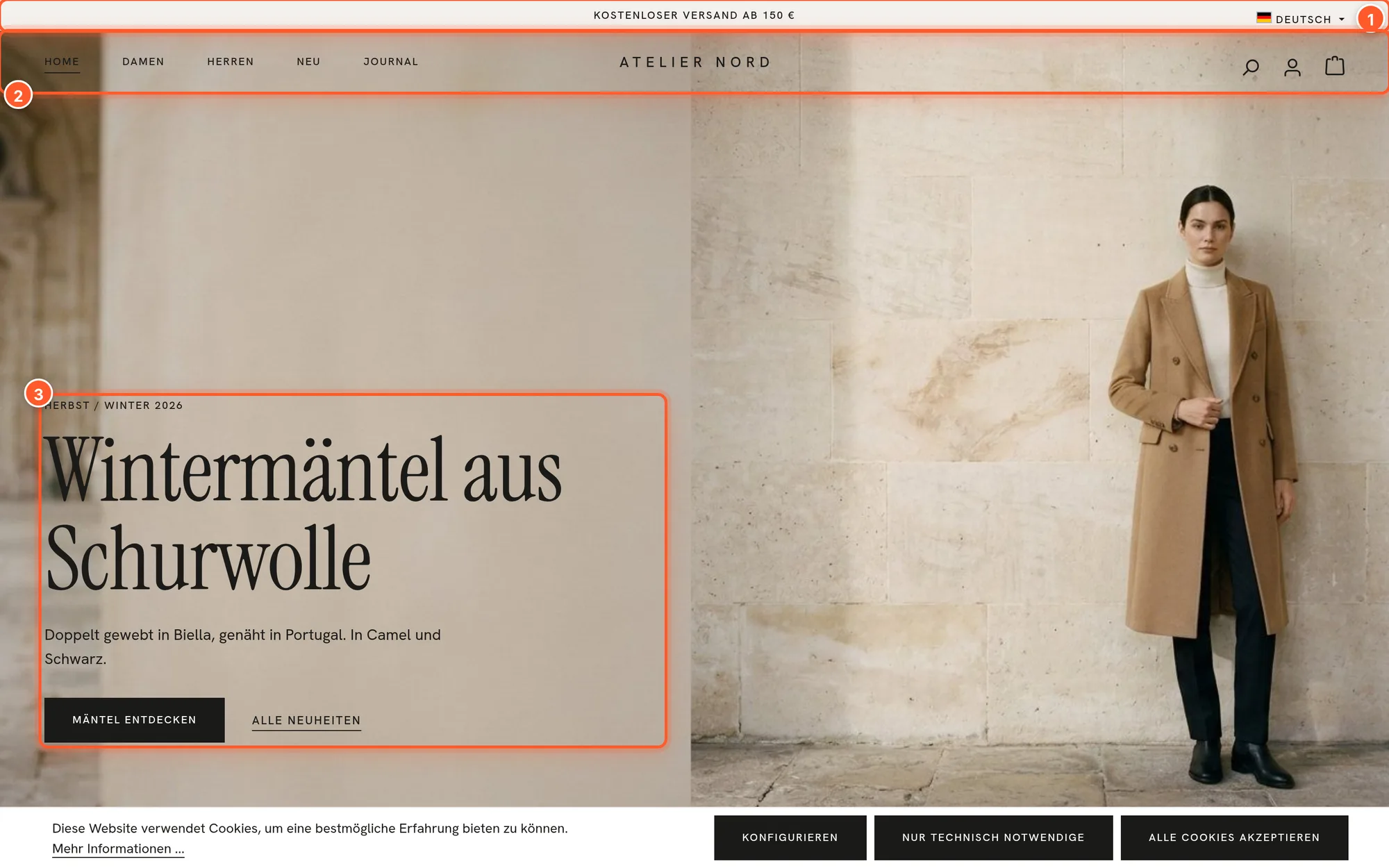
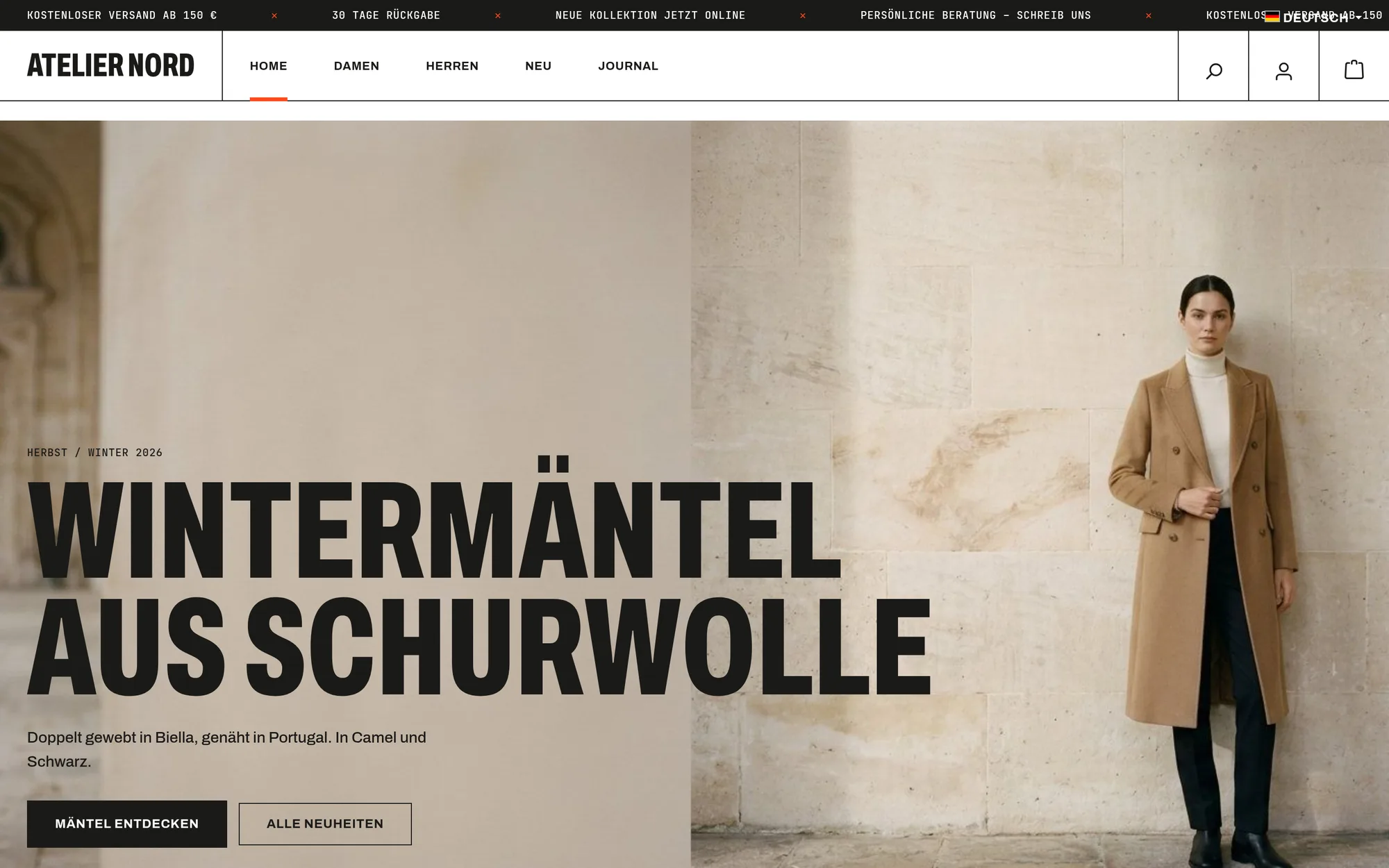
The theme has two design styles: A – Calm (lots of white space, serif headlines) and B – Bold (condensed capitals, hard lines, signal orange). On top of these sit six style presets that you apply with one click and undo just as easily.
Most features read your existing product data (variants, properties, images, stock, cross-selling). You only need custom fields where Shopware has no data, such as for the fit. And every feature can be switched off individually in the theme configuration.
Where to find what:
| What | Where in the Administration |
|---|---|
| Setup page (overview, demo data, style presets, texts, assistant) | Settings › Extensions › Set up FASHION ONE |
| Theme configuration | Content › Themes › FASHION ONE, sections in the sidebar on the left |
| Assign the theme to a sales channel | Sales Channels › your channel › “Theme” tab |
| Elements for pages | Content › Shopping Experiences › layout › “FASHION ONE” block category |
| Custom fields | Product (Specifications tab), category (General tab), manufacturer, each in the Custom fields card |
| All other texts | Settings › Snippets, search for flinkFashion |
Setup
Requirements: Shopware 6.7 (from 6.7.0, below 6.8) and a storefront sales channel.
Step 1: Install
- Open Extensions › My extensions. If you bought the theme in the Shopware Store, it’s in the list there; if you have a ZIP file, click Upload extension.
- Install and activate FASHION ONE.
On installation, the theme creates five custom field sets (fit, badge, flyout teasers, category hero and promo tile, product safety). On the command line, use bin/console plugin:install --activate FlinkThemeFashionOne.
Step 2: Assign the theme
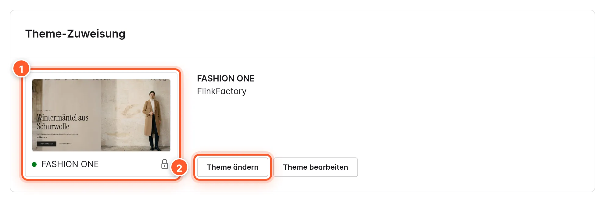
- Open Sales Channels and choose your storefront channel.
- Switch to the Theme tab, click Change theme 2, choose FASHION ONE and confirm.
- Save. Shopware then compiles the theme; the Administration tells you when it’s done.
Alternatively, choose the channel under Content › Themes › FASHION ONE in the Assigned to the following sales channels field.
Step 3: Open the setup page
The fastest way to do everything else is the setup page: Settings › Extensions › Set up FASHION ONE. You can also reach it via the “Set up FASHION ONE” card on the theme’s overview (Open the setup page).
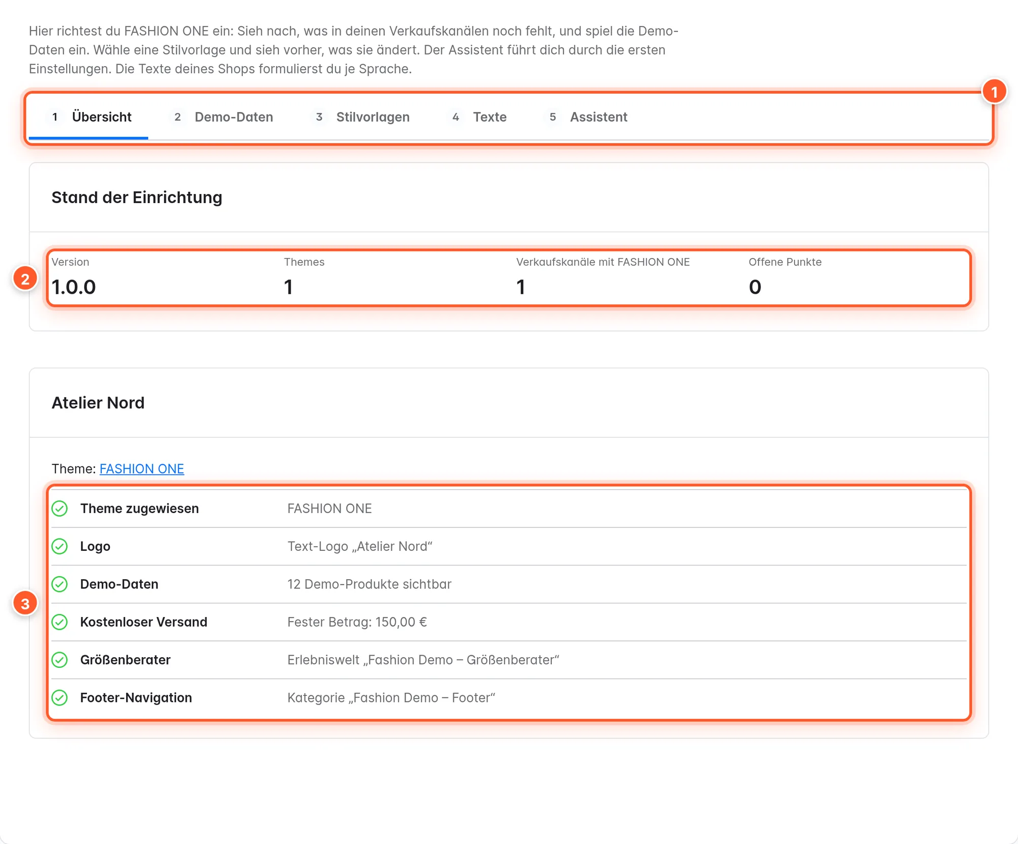
The Overview tab shows a checklist 3 for each channel with FASHION ONE. Every open item has a button that takes you exactly to where you take care of it:
| Item | Done when … |
|---|---|
| Theme assigned | the channel uses FASHION ONE or a copy of it |
| Logo | an image logo or a text logo is set (no longer the Shopware logo) |
| Demo data | demo products are visible in the channel (just a hint, not a must) |
| Free shipping | an amount is set: entered as a fixed value, determined from the shipping methods, or deliberately “Don’t show” |
| Size guide | a layout is chosen in Size guide (shopping experience) |
| Footer navigation | the channel has a category for the footer |
Anyone who may view themes may view the page. To make changes, you need permission to edit themes or the system settings; otherwise the buttons are locked.
Step 4: Import the demo shop (optional)
In the Demo data tab you import the sample shop “Atelier Nord” without the command line: 12 fashion products with size and color variants and “Goes well with”, the “Fashion Demo” category tree (Women, Men, New, Journal), images, four demo Shopping Experiences (home page, autumn/winter with countdown, journal story, size guide), a manufacturer with product safety details, and footer navigation and service menu.
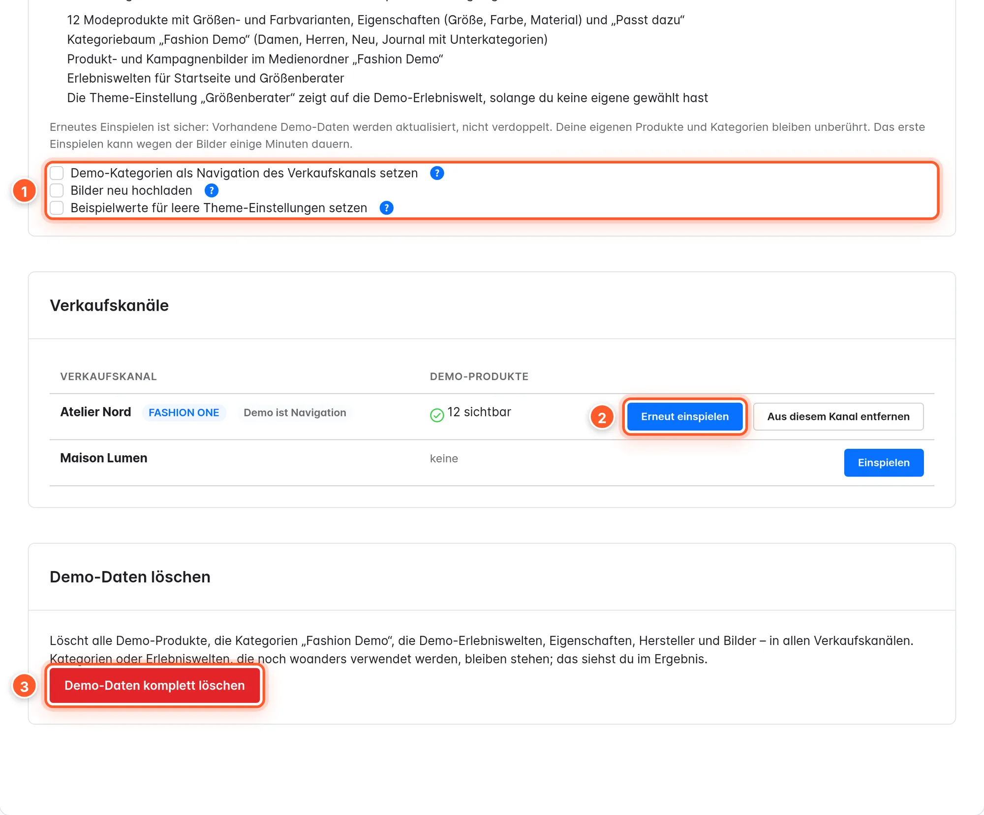
- Import / Import again 2 creates or updates the demo and makes the products visible in the channel. Importing again doesn’t duplicate anything; your own products and categories stay untouched. The first import can take a few minutes because of the images; keep the page open meanwhile.
- Remove from this channel only hides the demo products in this channel.
- Options 1: Use the demo categories as the sales channel’s navigation (only for test and preview channels), Upload the images again, Set example values for empty theme settings (phone, email, social networks in the footer; values you’ve set stay).
- Delete all demo data 3 removes everything the demo created, in all channels. Anything still in use (e.g. the demo category as a channel’s entry point) stays; the result tells you what.
The demo is written in German and English: languages with a German locale (de-DE, de-AT, de-CH) get the German texts, all others the English ones, including the SEO URLs.
Demo pages as templates: You’ll find the four demo layouts under Content › Shopping Experiences (“Fashion Demo – Startseite” etc.). They’re built entirely from the theme’s elements. Duplicate them and swap images and texts, and you have a finished home page in minutes.
Step 5: Set the look
Choose a preset in the Style presets tab (see Styles and style presets) or let the Assistant guide you through logo, colors and basics (see Assistant). Your shop is then ready to go.
Step 6: Check your product data
For sizes and colors, the theme needs variants with properties:
- Color group: Under Catalogues › Properties, set your colors’ property group to Colour or Image under Display type. That’s how the theme recognizes colors.
- Size group: The theme treats the first variant group that isn’t a color or image group as the size (e.g. “Size” with XS to XL).
Styles and style presets
Style A and style B
A theme has exactly one design style: Content › Themes › FASHION ONE › Design › Style › Design style. All features, elements and settings exist in both styles; the style changes fonts, lines, colors and some default values, not your content.
| Style A – Calm | Style B – Bold | |
|---|---|---|
| Headlines | Instrument Serif, as written | Archivo 800, in capitals |
| Body text | Hanken Grotesk | Archivo |
| Labels | same as the body text | JetBrains Mono |
| Logo | centered | on the left in its own box |
| Header above a hero | lies transparently over the image | sits above the image |
| Announcement line | first text, static | all texts as a ticker |
| Footer | light (card color) | dark (text color) |
| Image shown first in categories | product image | on-model image |
| Highlight in element headlines | italic | as an outline |
Many settings are set to “Style default” out of the box: then the style’s value applies (shown in brackets). If you choose your own value, it applies in both styles.
Applying style presets
A style preset isn’t a third style but a variation of A or B: it sets the design style and, on top of that, fonts, colors, corners, spacing, header, product cards and icons. Anything a preset doesn’t explicitly change is reset to the default value, so nothing from the previous one is left over when switching.
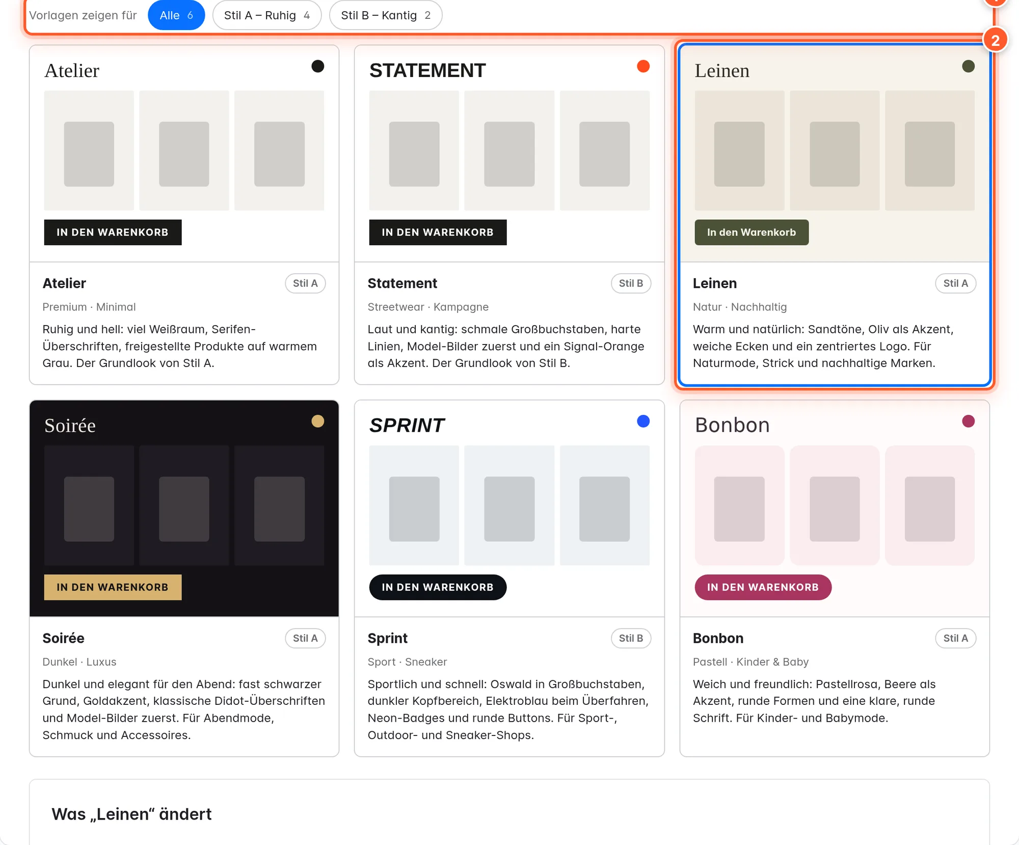
| Preset | Style | Look |
|---|---|---|
| Atelier | A | Style A unchanged: serif headlines, lots of white space, products on warm gray |
| Statement | B | Style B unchanged: condensed capitals, hard lines, signal orange |
| Linen | A | Sand tones, olive green buttons, DM Sans, small corners, logo centered with navigation below |
| Soirée | A | Almost black background, gold buttons, Bodoni Moda, on-model images first |
| Sprint | B | Oswald, dark header and footer, electric blue, neon yellow badges, round buttons |
| Bonbon | A | DM Sans, pastel pink with berry, round buttons and image corners, centered card texts |
Here’s how:
- At the top, choose the Theme that is written to. The page tells you in which channels the change becomes visible immediately.
- Click a preset. Below it, What “…” changes appears: every setting that changes, with the Now and New values.
- Keep own values is preselected (it appears if you’ve set your own values): your settings stay as they are.
- Click Apply “…”. The values are saved and the theme is recompiled.
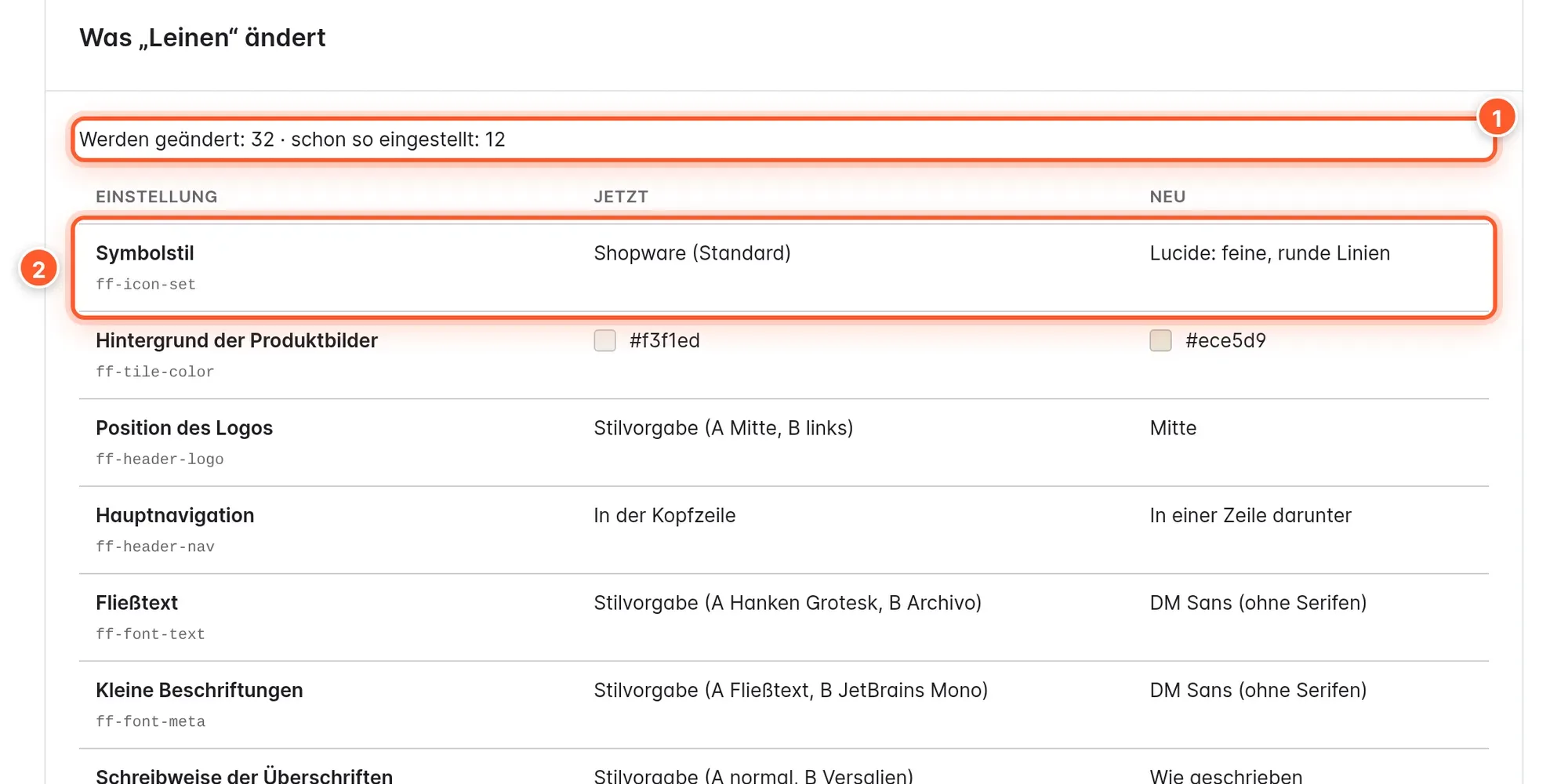
Undo: Under Last change you’ll see the most recently applied preset (or the assistant). Undo restores the previous values exactly. There’s one level per theme.
Try it out safely: Duplicate the theme under Content › Themes (“…” menu › Duplicate) and don’t assign the copy to any channel. Choose the copy at the top as the theme that is written to, and try presets without your customers seeing anything.
Style A and B in two sales channels
If you want to run one channel in A and another in B, duplicate the theme, set the Design style in the copy to “B – Bold” and assign it to the second channel. The copy inherits all settings it doesn’t set itself; if you later change something in the original, the copy takes it over.
Assistant
The Assistant tab guides you through an initial setup in four steps. Everything runs in your browser and your shop; nothing is sent to a third-party service.
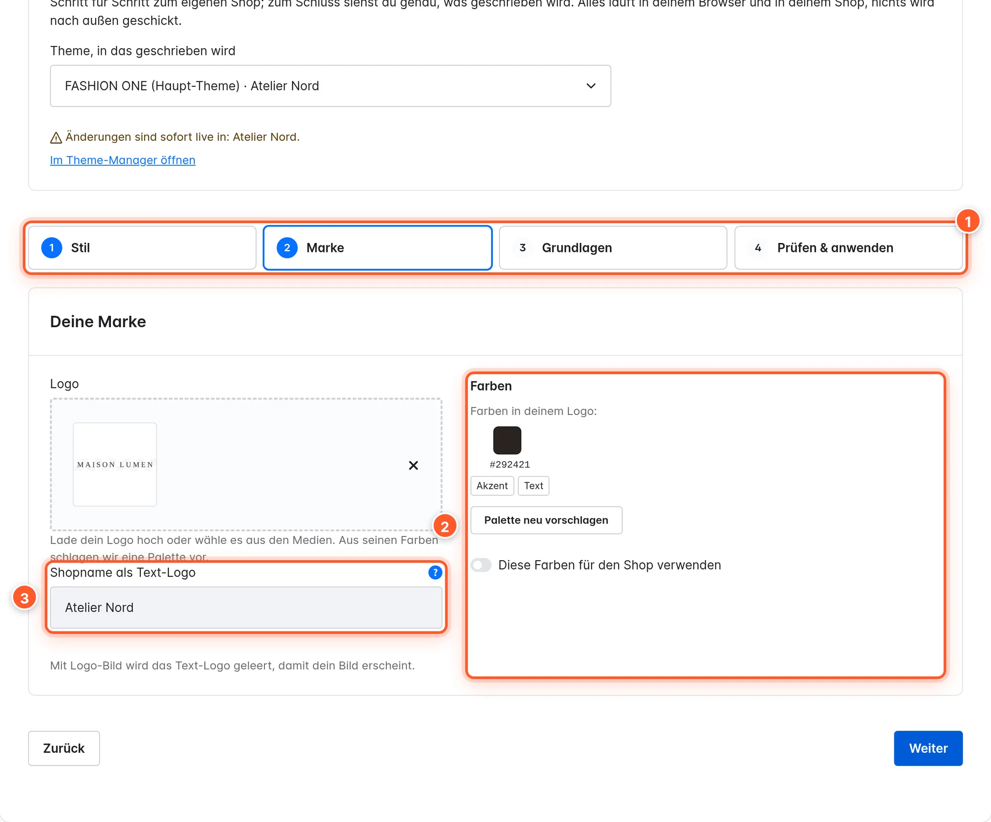
- Style: one of the six presets as the basis, or Keep the current design.
- Brand: Upload your logo or choose it from the media. The browser reads the logo’s colors 2 and suggests a palette (accent, text, background). Below that, the assistant checks the contrasts according to WCAG AA; Correct automatically adjusts a color that’s too weak. Without a logo image, enter a Shop name as text logo 3.
- Basics: amount for free shipping (only with a fixed amount), layout for the size guide, phone and email for the footer.
- Check & apply: the exact list of settings with old and new value. Apply settings saves and compiles.
You also undo the assistant in the Style presets tab under Last change.
Texts per language
A theme setting has one value for all languages. That’s why the texts you write yourself for the shop aren’t in the theme configuration but in the setup page’s Texts tab: the four texts of the announcement line, the service bar, the search field placeholder, the four benefits, newsletter headline and text, service hours, copyright line, the product page’s returns text and the empty cart text.
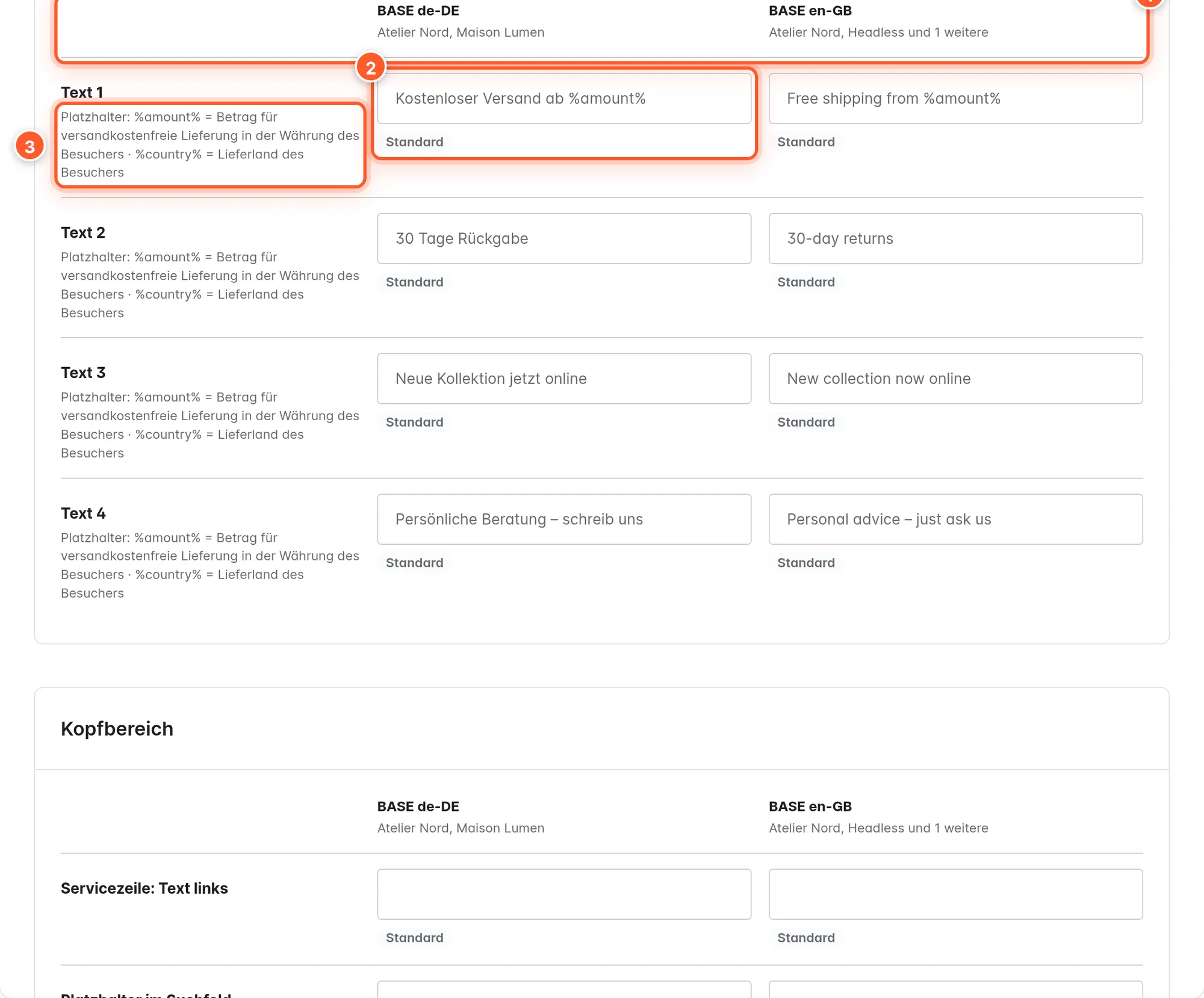
As long as you don’t change a text, the shop shows the theme’s suggestion (German and English). New texts appear immediately, without compiling. Placeholders:
%amount%– the visitor’s free shipping amount, in their currency. If there’s no amount, the whole text is dropped.%country%– the visitor’s delivery country, e.g. “Free shipping to %country% from %amount%”.%year%– the current year.%shop%– the text logo or the shop’s name.
You change all other theme texts under Settings › Snippets; search there for the text or for flinkFashion.
Theme configuration and live preview
You’ll find the settings under Content › Themes › FASHION ONE. On the left there’s a sidebar with the search field and the sections Overview, Logo & basic colours (Shopware’s basic settings) and the theme’s eight sections: Design, Header, Categories & product cards, Product page, Cart & checkout, Footer, Phones and Extras. Below the open section, its cards are listed as jump links.
Searching for a setting
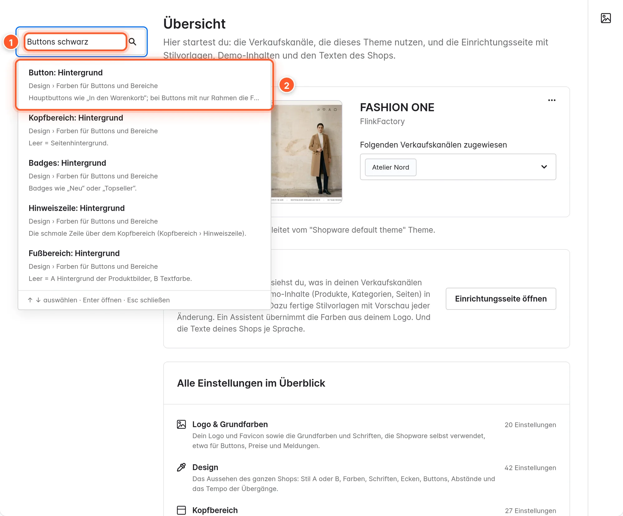
The theme has almost 200 settings of its own. You don’t need to know them: type what you want to change into the search field 1, for example “black buttons”, “don’t crop product images” or “logo”. The search understands everyday language, typos and both German and English terms.
Live preview
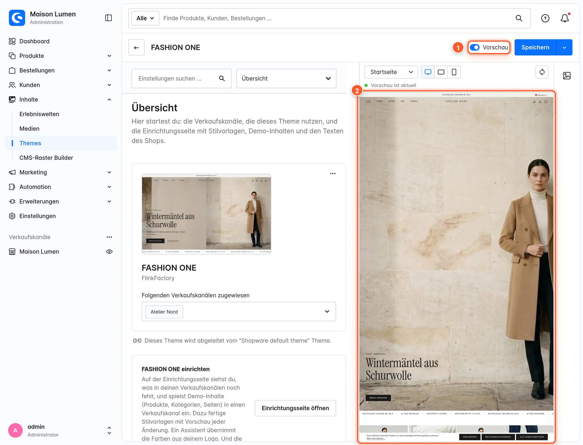
The Preview toggle 1 at the top next to “Save” splits the page: settings on the left, your shop on the right 2. You see every change there before you save.
- Toggles, selections, links, icons: The preview reloads the page.
- Colors, fonts, sizes, spacing: The theme calculates its own stylesheet in the background (“Calculating stylesheet …”) and swaps it in without reloading.
- Page, device, channel: In the row above the preview you choose home page, category, product, search, cart or login, plus desktop, tablet or smartphone. If you open e.g. “Product page” on the left, the preview jumps to a product.
- Own window: The preview can be moved to a second screen; in browser windows below 1280 pixels, this is the only form available. You can drag the divider.
Visitors see nothing until you save. An error in custom CSS appears as a message above the preview; the preview then keeps the last valid state.
Shopping Experience elements
FASHION ONE comes with nine elements. Open a layout under Content › Shopping Experiences, open the blocks on the right and choose the “FASHION ONE” block category. All blocks start with “FASHION ONE:”. Drag a block onto the page and open the settings via the gear on the element.
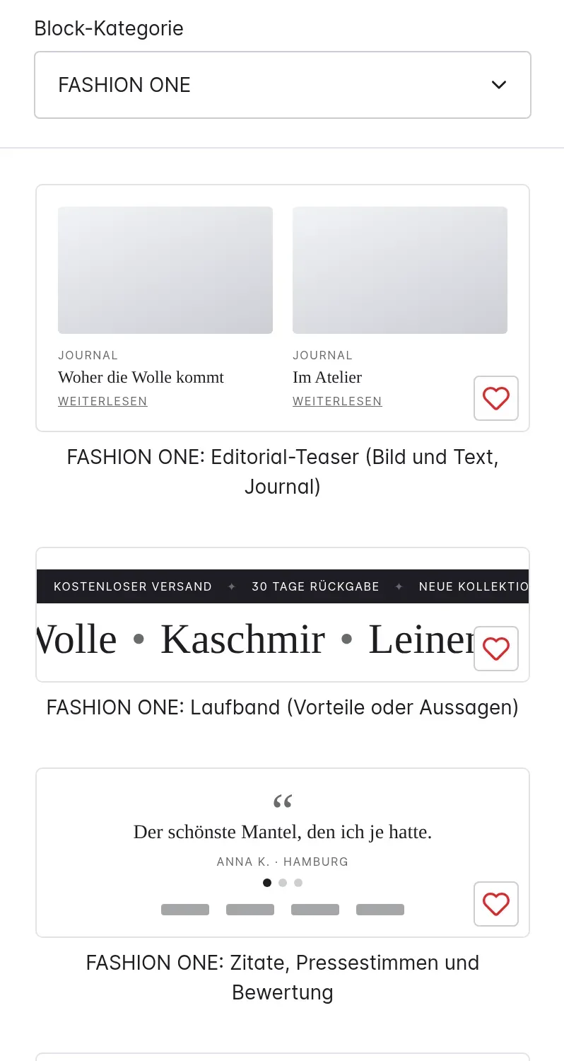
| Block | What for |
|---|---|
| Lookbook (Shop the Look) | Image with numbered hotspots and the products of the look |
| Hero | Big entry point: image, split, slider (up to 5 slides) or video |
| Countdown / drop banner | Countdown to a date, e.g. for a collection drop |
| Category tiles | Up to eight categories as a row, mosaic or text list |
| Product row | New arrivals, selected products, a category or a dynamic product group |
| Shop the feed | Image grid like a social feed, each image with a product or link |
| Editorial teaser | Image and text teaser for journal and campaigns |
| Moving line | Scrolling text with benefits or statements |
| Quotes, press logos and rating | Customer quotes, press logos or a rating score |
You translate texts in elements just like Shopware elements, via the Shopping Experience’s language selector. You choose products via the search by name or product number; it shows main products, not individual variants.
Hero
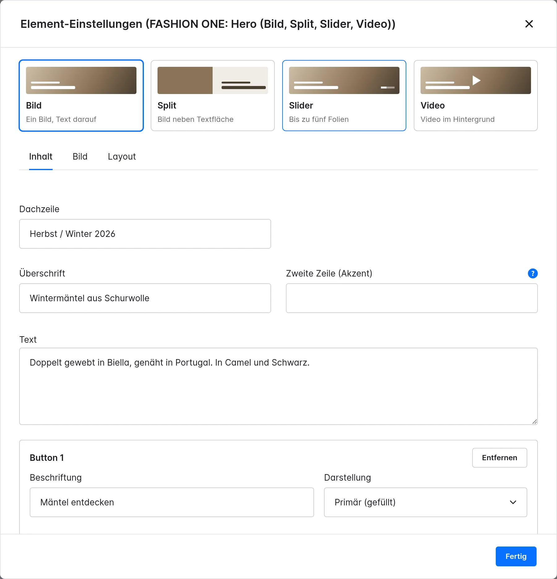
- Content: eyebrow, headline, Second line (accent) (italic in style A, outlined in style B), text and up to two buttons (primary or secondary). A button without a link isn’t shown.
- Image: image or video (MP4/WebM, muted, ideally under 10 MB), a separate image for smartphones, focal point by click, text color light/dark, darken/lighten 0–80 %.
- Layout: nine text positions on desktop, top/bottom on smartphones, height (100–50 % of the screen height or a fixed format), headline as H1–H4, and for the slider, auto-advance and seconds per slide.
If the hero is the first block on the page, the header lies transparently over it in style A (setting Transparent over a hero). Only use H1 for the first hero of a home page, otherwise H2.
Lookbook and “Buy the look”
An image with numbered dots, next to it the products of the look with image, price and sizes. Dot and row light up together.
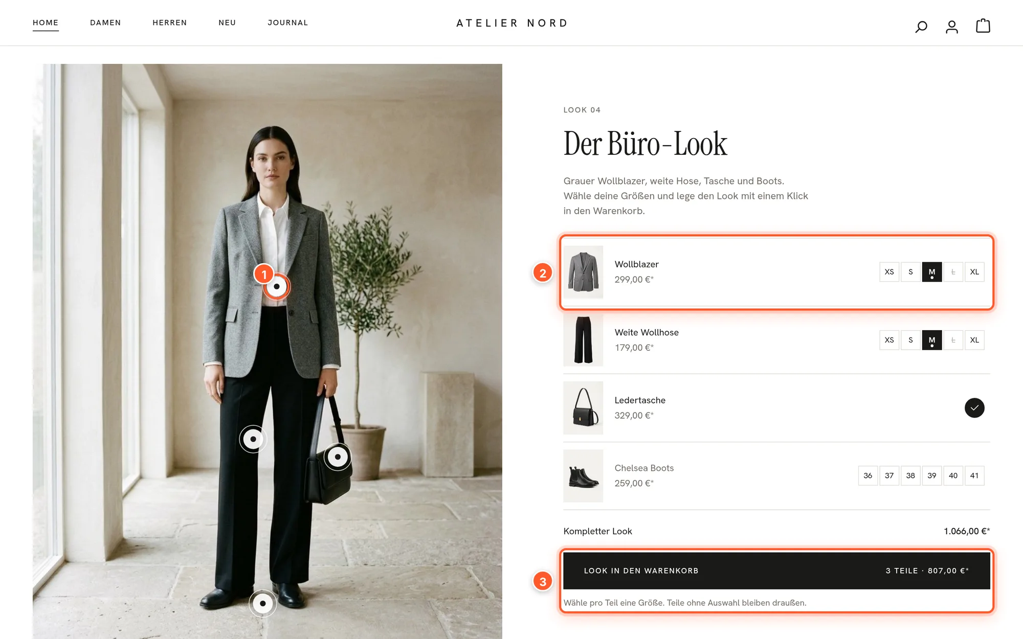
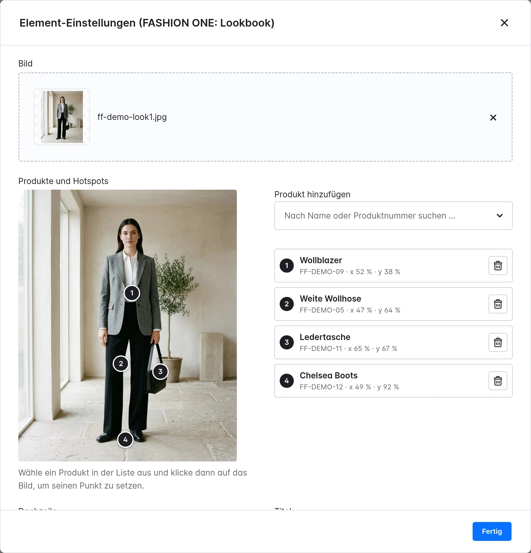
How to set the dots: under Products and hotspots, choose the pieces with Add product, select a product in the list and click on the image to place its dot.
Under When a size is clicked you choose:
- Buy the look: Visitors choose a size per piece, and one button adds all selected pieces to the cart in a single request. Pieces without a selection are left out.
- Single pieces: A click on a size adds the piece to the cart immediately.
Every product that appears in a lookbook automatically shows the look on its product page too, under Styled in a look – without you having to maintain anything:
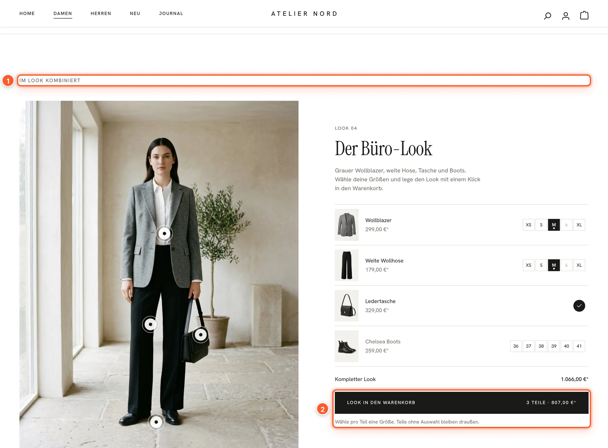
The other elements
- Countdown / drop: Target date with the shortcuts “+ 1 day” and “+ 1 week”. At zero: show a second text with a button, hide the element or stop at 00:00:00. Format: large banner or slim bar. When zero is reached is decided by the clock in the visitor’s browser, even if the page comes from the cache.
- Category tiles: up to eight categories with their own label and image (otherwise the category’s image). Without a selection, the element shows the channel’s main categories. Swipeable on smartphones or two per row.
- Product row: the shop’s new arrivals, up to 16 selected products, a category or a dynamic product group, sorted by new, best-selling, price or name. Layout: swipeable row, grid or with a large image. The cards have quick buy, color dots and badges just like in categories.
- Shop the feed: up to twelve images, each with a product or address. On hover, name and price appear. Nothing is embedded from Instagram or other services.
- Editorial teaser: layouts side by side, stacked, overlapping, two or three teasers. Words between *asterisks* in the headline are highlighted.
- Moving line: up to eight short texts with an optional link, small as a ticker or large as a display. Pauses while the mouse is on it.
- Quotes and press: up to six quotes (slider or cards), up to ten press logos (monochrome, optionally in color on hover) or a rating with stars. You enter all values yourself; nothing is loaded from a review service.
Fashion features in the shop
Category pages
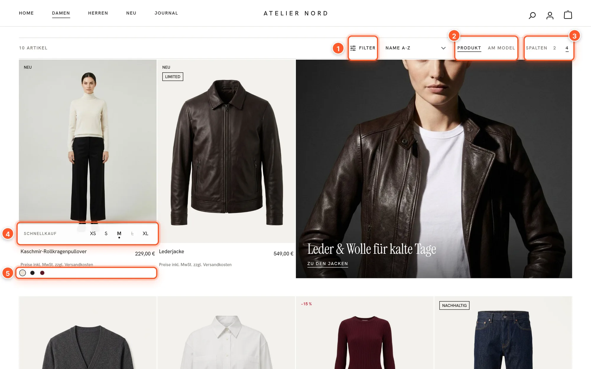
- View switch 2: Visitors choose whether the cards first show the product image or the on-model image (second gallery image). Their browser remembers the choice.
- Column choice 3: 2 columns or your default on desktop, 1 or 2 on phones.
- Quick buy 4: The sizes appear in the card; a click adds the size to the cart and opens the cart drawer. Sold-out sizes are struck through. Options: off, on hover, always visible or Plus button, also on phones.
- Color dots 5: When the mouse moves over a dot, the card shows that color’s image. More colors than configured appear as “+n”.
- Badges: discount in percent (“−15 %”), “Sold out”, “Only a few left” and a custom text from the product (e.g. “Limited”, “Sustainable”).
- Video in the card: If a product has a video in its gallery, it plays muted on hover (not on touch devices).
The Filter 1 button opens all filters in a sidebar, on every screen size. Colors appear as color swatches with names, sizes as buttons:
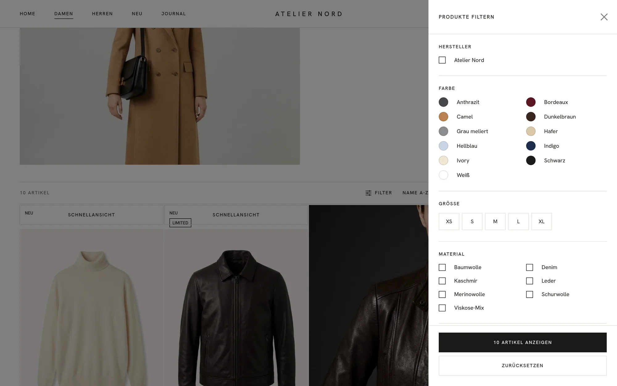
Category hero and promo tile: Optionally, an area with image, eyebrow, headline and text sits above the product list instead of the plain headline. On the first page, a promo tile spanning two columns appears (position in the grid 1–12, default 3). You maintain both in the category, see Custom fields.
Product page
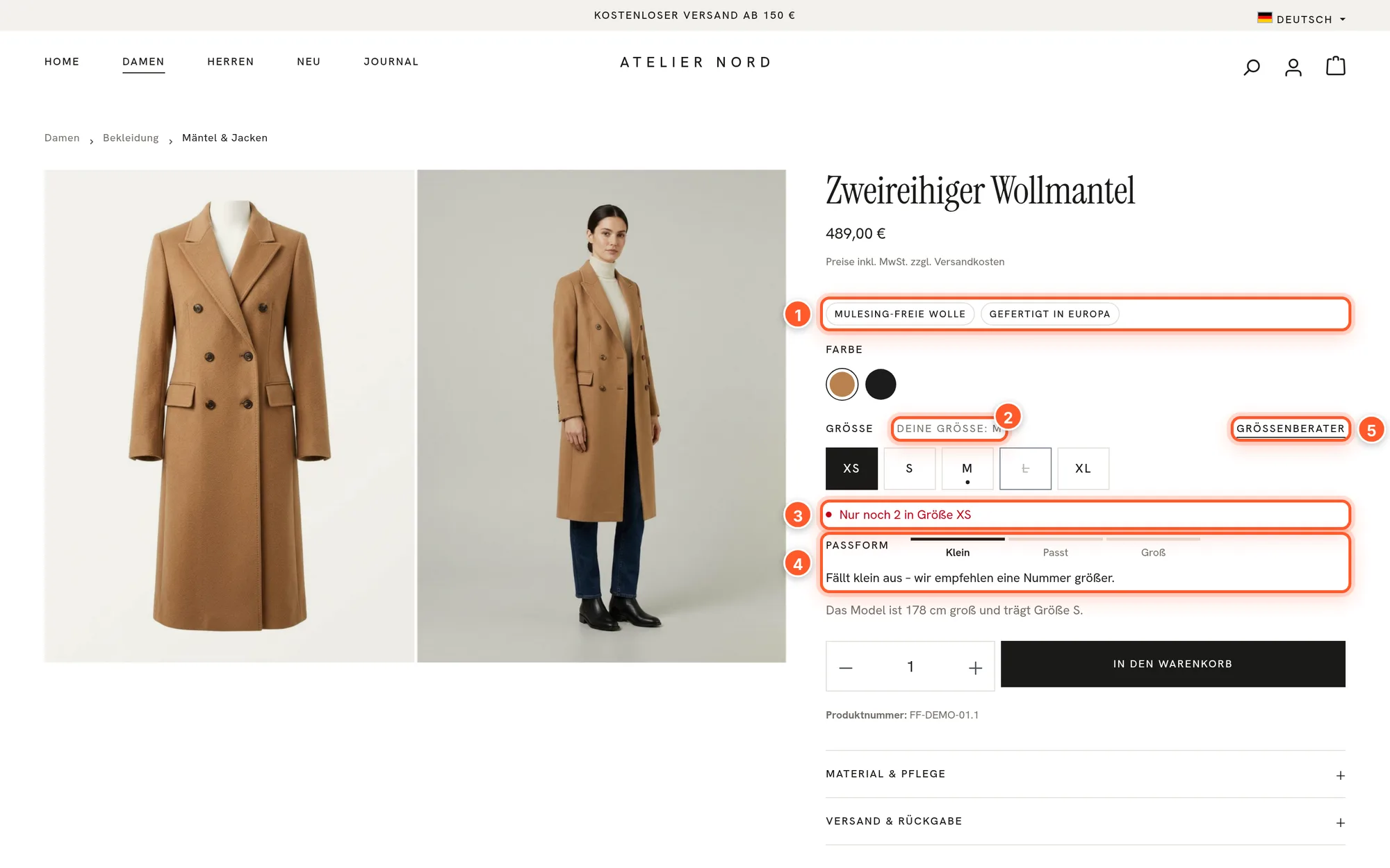
- Remembered size 2: When a visitor chooses a size, their browser remembers the label (e.g. “M” or “38”). Cards, product rows, looks and product pages then mark this size. The variant is never switched automatically. Only works with consent to the comfort features (see Privacy).
- Low stock 3: “Only 2 left in size XS” as soon as the selected variant has no more pieces than configured (default 3, 0 = off).
- Fit 4 and model note: three-step scale (Small – True to size – Large) with a sentence, below it e.g. “The model is 178 cm tall and wears size S.” From the product’s custom fields.
- Size guide 5: Next to every option group that isn’t a color group, the link opens a layout in a window, e.g. with a size chart. Choose it under Product page › Buy column › Size guide (shopping experience).
- Seals 1: the options of a property group as small badges below the price, with the option’s image as an icon.
Below the buy button come expandable details and “Goes well with”:
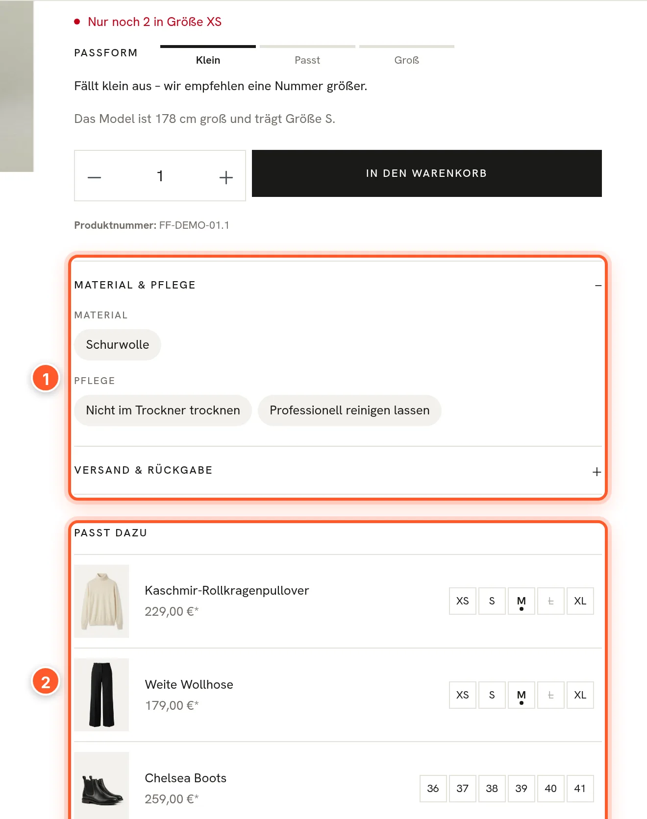
- Material & care 1: the options of the property groups you select under Product page › Details and seals › Groups for “Material & care” (several, in your order). Without a selection, the section is dropped. If an option has an image, it appears as an icon.
- Shipping & returns: delivery time, free shipping amount and a sentence on returns (text in the “Texts” tab), optionally with a link to a layout.
- In short: the first paragraph of the product description.
- Goes well with 2: up to three products from the product’s first cross-selling group as compact rows with sizes. If the group has no more than three products, it doesn’t appear again further down.
- Product safety (GPSR): a separate section next to description and reviews with the manufacturer’s name, address and contact and optionally the responsible person in the EU, from the manufacturer’s custom fields.
- Recently viewed: a row below the product page (default 8, at most 12 products), only with consent to the comfort features.
Header and flyout menu
In a main category’s flyout menu, up to two teasers with image, headline and link sit next to the subcategories on desktop. You maintain them in the main category’s custom fields.
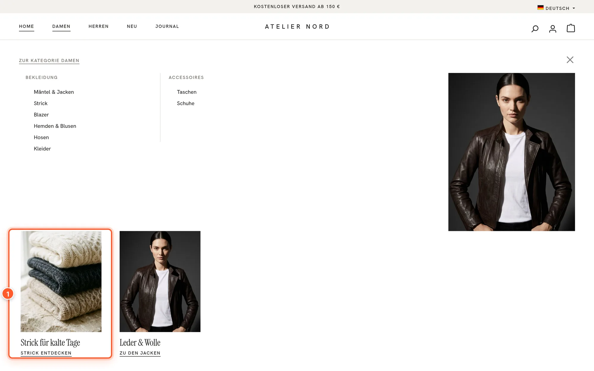
Also configurable: text logo instead of an image, logo position, navigation in the header row or a row below, behavior when scrolling (always visible, only when scrolling up, not fixed), announcement line with 1–4 texts (static, rotating or as a ticker, optionally closable), a service bar with language and currency selection, and the icon style.
Cart
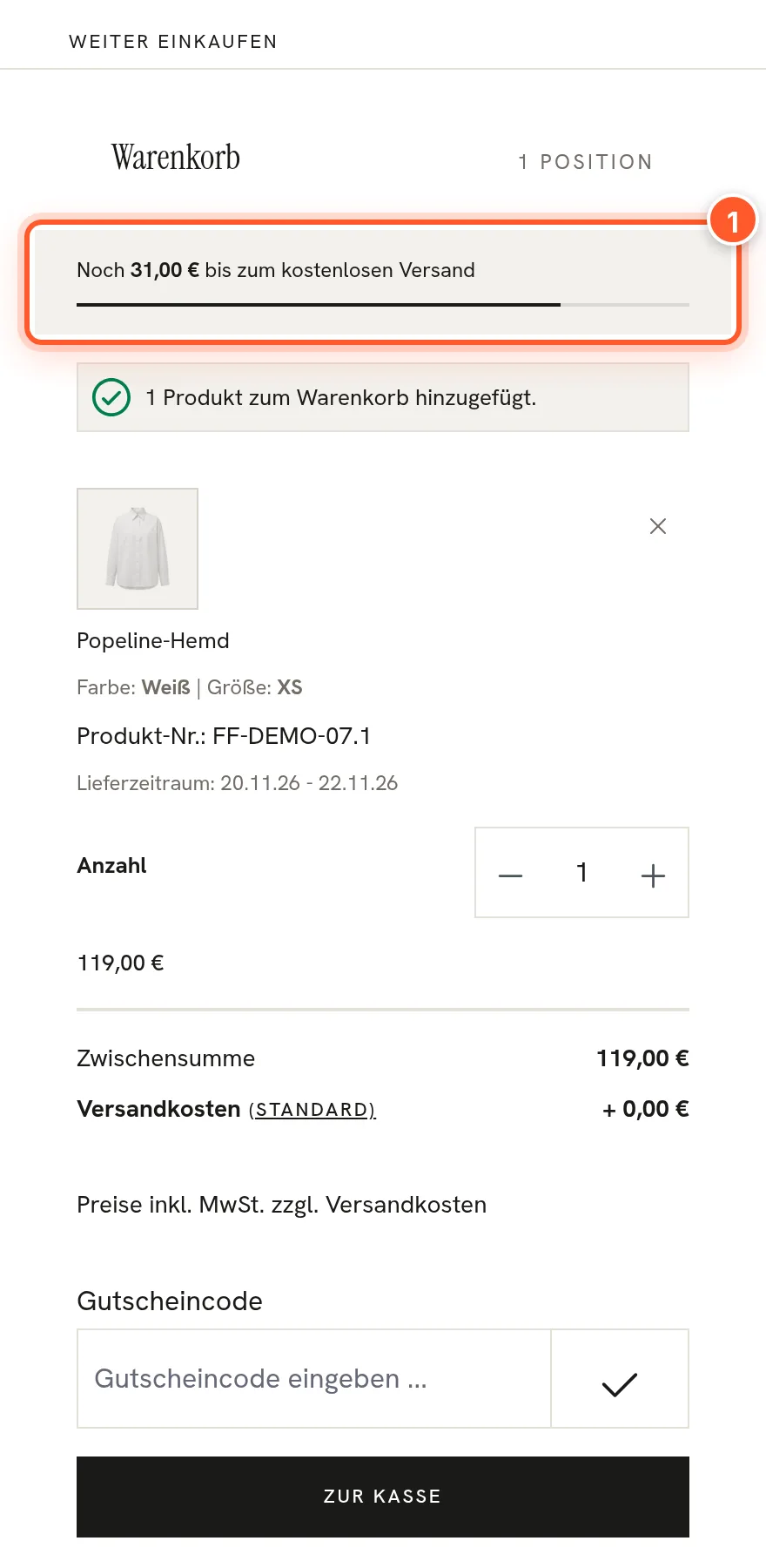
Under Cart & checkout › Free shipping › Amount for free shipping you choose where the amount comes from:
- From the shipping methods (default): Each visitor sees the order value from which their shipping method is free, matching delivery country, customer group and currency. If shipping is never or always free, the bar and texts with the amount are dropped.
- Fixed amount: one amount (gross) for everyone; use it if you handle free shipping via promotions or other extensions the shop can’t see.
- Don’t show.
On top of that: “Goes well with” in the drawer (off by default), coupon field open or collapsed, link to the order comment, payment methods below the checkout button, step indicator and a reduced header in the checkout.
Phones
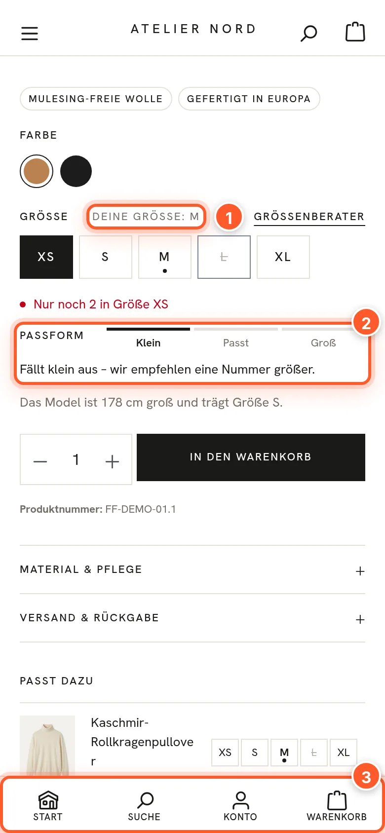
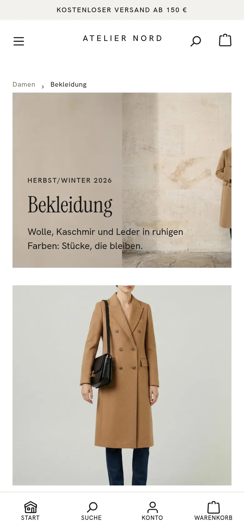
You configure the Navigation bar at the bottom (categories, home, search, wishlist, account, cart) in the Phones section, and the buy bar that appears on product pages when scrolling under Product page › Description, cross-selling, buy bar.
Custom fields
You only need custom fields for information Shopware doesn’t have. All are optional; variants inherit the main product’s values.
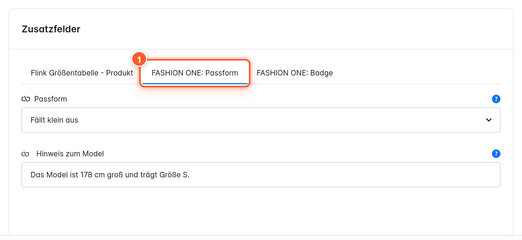
| Set | Belongs to | Fields |
|---|---|---|
| FASHION ONE: fit | Products (Specifications tab) | Fit (Runs small / True to size / Runs large), Model note |
| FASHION ONE: badge | Products | Badge (custom text on the card, e.g. “Limited”) |
| FASHION ONE: category hero and promo tile | Categories (General tab) | Hero: image, eyebrow, headline (empty = category name), text, text color, height; Promo tile: image, headline, link text, link (URL), position in the grid |
| FASHION ONE: flyout teasers | Main categories | Teaser 1 and 2: image, headline, link text, link (URL) |
| FASHION ONE: product safety (GPSR) | Manufacturers | Manufacturer: name, postal address, email or website; responsible person in the EU: the same three details |
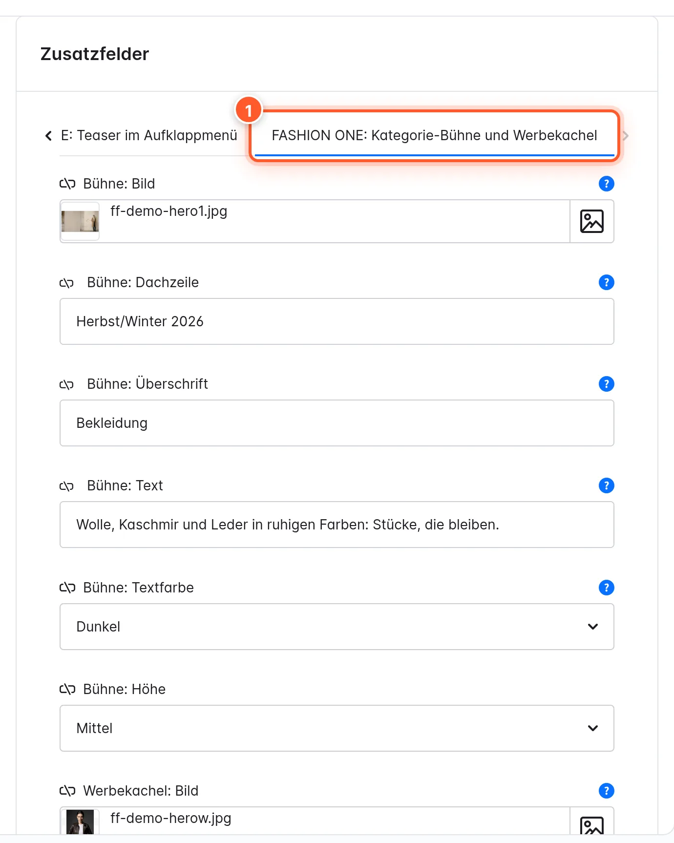
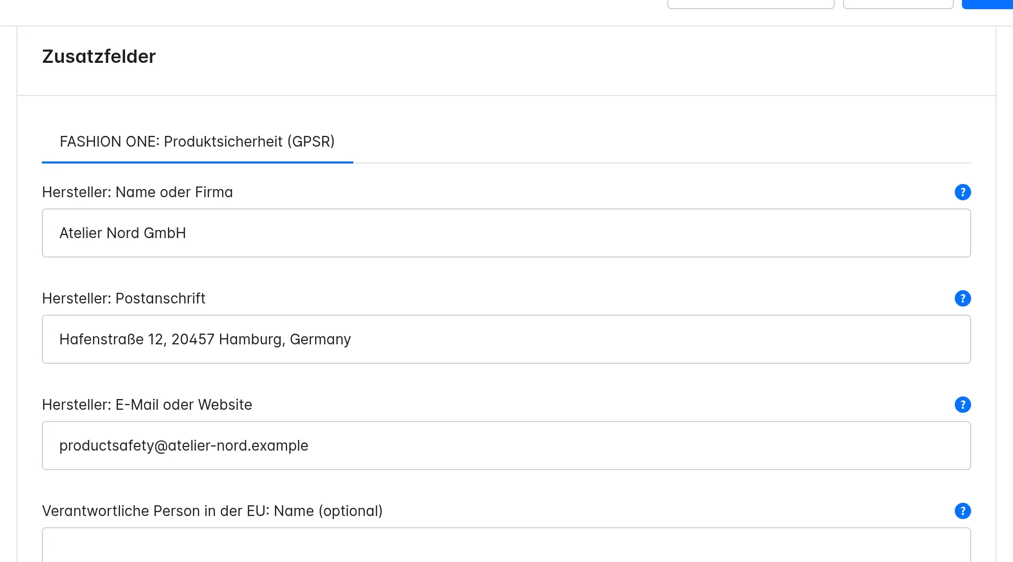
You also see the sets under Settings › Custom fields. Don’t change the technical names there (ff_product_fit, ff_product_badge, ff_category_hero, ff_category_flyout, ff_manufacturer_safety); the theme reads the fields under these names. If you’ve accidentally deleted a set, bin/console flink:fashion-one:custom-fields:sync creates it again.
Settings
All settings are under Content › Themes › FASHION ONE. A few rules apply everywhere: Style default means the value comes from style A or B; empty color fields take the color from “Logo & basic colours” or the style (the help text says which); after saving, Shopware recompiles the theme.
| Section | Cards and key settings |
|---|---|
| Design | Style (design style A/B) · Page colours (accent color style B, background, text, secondary text, lines, sale, Product image background) · Fonts (Archivo, Bodoni Moda, DM Mono, DM Sans, Hanken Grotesk, Instrument Serif, JetBrains Mono, Oswald or system font; all served from your own server) · Button and area colours · Corners, buttons and spacing · Animations (off, fast, normal, slow) · Icons (icon style) |
| Header | Layout (text logo, logo position, navigation, Transparent over a hero) · When scrolling · Announcement line · Service bar · Icons and search · Flyout menu (columns, images, Show category teasers) · Phone menu |
| Categories & product cards | Card image, spacing and frame (image format, hover effect) · Text and price (maximum color dots, show available sizes …) · Video and badges · Quick buy (Quick buy with size selection) · Toolbar and filters (filters, view switch, image shown first, columns per device) · Category top and promo tile |
| Product page | Images (grid, large first image, one column, slider) · Buy column (incl. “Goes well with”, Size guide (shopping experience)) · Sizes (Remember the visitor’s size, “Only a few left” from stock (pieces)) · Details and seals · Description, cross-selling, buy bar (tabs/accordion/sections, “Product safety”, buy bars) · Looks · Recently viewed |
| Cart & checkout | Free shipping (amount, progress bar) · Cart drawer · Cart page and checkout |
| Footer | Newsletter · Columns and contact · Logo and social networks (Instagram, TikTok, Pinterest, Facebook, YouTube, LinkedIn – links only) · Payment and shipping methods · Bottom row |
| Phones | Navigation bar (items, labels) |
| Extras | Benefits (four benefits with icon, optionally below the header, above the footer, below the buy button, in the cart) · Breadcrumbs · Paging in categories (page numbers or “Load more”) · Cookie notice (bar, box, window) · Accessibility (stronger focus ring, click targets of at least 44 × 44 px) · Back-to-top button · Custom CSS |
The footer columns come from your channel’s footer navigation (Sales Channels › channel › Entry point for footer navigation). Every setting with its default value and help text is right there in the Administration: the help text (?) next to each field explains it, and the search finds it.
Privacy and compatibility
The theme sets no cookies, embeds no third-party services and loads the fonts from your own shop. Some features store a visitor’s choice in their browser; all entries are listed in Shopware’s cookie notice:
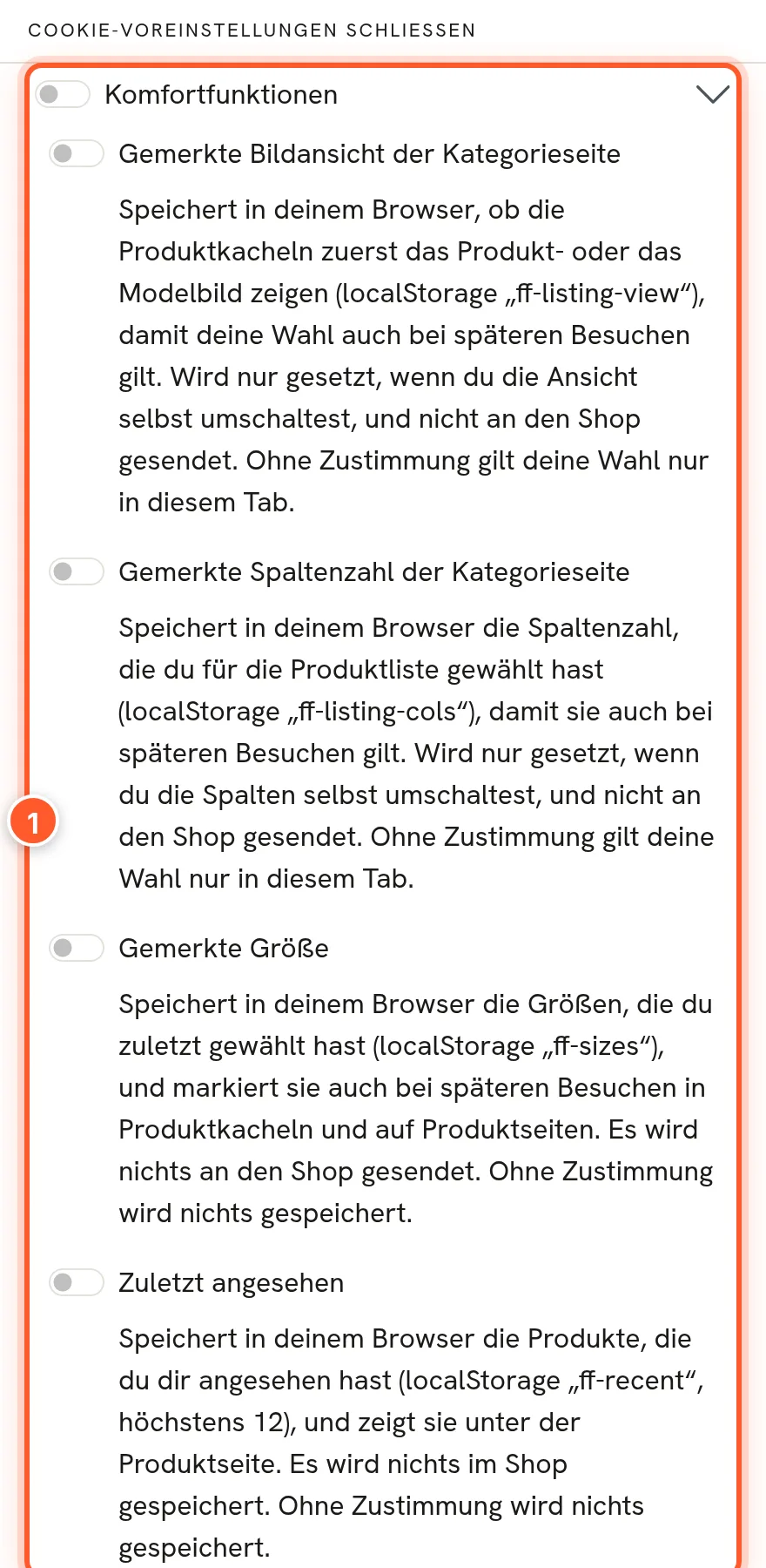
| Key | Content | Group |
|---|---|---|
ff-listing-view | “Product” or “On model” view | Technically required |
ff-listing-cols | selected number of columns | Technically required |
ff-announce-closed | announcement line closed (only for the browser tab) | Technically required |
ff-sizes | up to 6 remembered sizes | Comfort features |
ff-recent | up to 12 recently viewed products | Comfort features |
Remembered size and Recently viewed only work with consent to the “Comfort features”. Without consent, nothing is stored; quick buy still works. If a visitor consents during the visit, it takes effect immediately; if they withdraw consent, the browser deletes the data immediately. If you switch a feature off, the theme doesn’t write its key and doesn’t list it.
Other extensions: The theme only extends Shopware templates (with parent()) instead of replacing them. Buttons from other extensions in the cards (compare, quick view, “Notify me”) stay visible. Tested with our Size Charts (the theme then hides its own size guide link; leave Size guide (shopping experience) empty) and with FroshProductCompare. Theme data is only loaded in channels with FASHION ONE or a copy of it. Checked on Shopware 6.7.0, 6.7.7, 6.7.14 and 6.7.16.
Tips & hidden features
- Find a setting without searching: The theme configuration’s search field understands phrases like “don’t crop product images” or “black buttons” and highlights the matching field.
- Look automatically on the product page: Every product in a lookbook gets the “Styled in a look” section on its own. A lookbook on the home page thus sells on all the product pages involved too.
- One click sets the focus: In the hero and the countdown, you set the image’s focal point with a click so nothing important gets cropped on smartphones. You can also add a separate image for smartphones.
- The
%country%placeholder: “Free shipping to %country% from %amount%” shows every visitor their delivery country and their amount. - Highlight in headlines: In the editorial teaser you highlight words with *asterisks*; in the hero there’s the Second line (accent) for this.
- Switch the icon style: Design › Icons › Icon style swaps all the shop’s icons (Lucide, Phosphor Light, Phosphor Fill, Material Sharp). Icons from other extensions and brand logos stay.
- Have contrasts checked: The assistant checks your colors according to WCAG AA and automatically corrects colors that are too weak, if you want.
- Reuse demo layouts: The demo Shopping Experiences are ready-made templates. Duplicate, swap images, done. Afterwards you delete the demo data with one click, and your copies stay.
- Command line:
bin/console flink:fashion-one:demo:install -s <channel ID> [--settings] [--force-media]andbin/console flink:fashion-one:demo:removefor deployments and staging systems.
Frequently asked questions
I changed a setting, but nothing changes in the shop.
After saving, Shopware recompiles the theme; that can take about a minute in the background. Reload the page afterwards. Also check that the channel really uses FASHION ONE (or your copy): Sales Channels › channel › “Theme” tab. Texts from the “Texts” tab, on the other hand, take effect immediately.
Why don’t my cards show color dots?
The color property group has to be set to Colour or Image under Display type, and the variants may only differ in color. A product with only one color shows no dots.
Why is there no quick buy on phones?
With “On mouse hover” it only appears on desktop with a mouse. Choose Plus button, also on phones or switch on Show available sizes. The product needs variants that differ in size.
Why isn’t any size marked as “your size”?
The feature needs consent to the “Comfort features” in the cookie notice and the Remember the visitor’s size setting. The marking compares the label: “M” only matches “M”, not “Medium”. Size groups displayed as a dropdown don’t get a marking.
The “Material & care” section is missing.
Select the property groups under Product page › Details and seals › Groups for “Material & care”. Without a selection, the section is dropped; the product also needs properties from these groups.
Why does the header lie over my home page image?
In style A, the header lies transparently over a hero when the page starts with the “FASHION ONE: Hero” block. To switch it off: Header › Layout › Transparent over a hero › off.
The free shipping progress bar doesn’t appear.
With “From the shipping methods”, your shipping method needs a price that drops to 0 from a certain order value. If shipping is always or never free, there’s nothing to show. If you handle free shipping via promotions, choose Fixed amount.
A product doesn’t appear in an element’s product search.
The search in lookbook, product row and shop the feed only shows main products. Choose the main product; in the shop, the card shows its main variant.
Does the total for “Buy the look” include surcharges for individual sizes?
No, the total uses the displayed price. In the cart, the correct price applies.
How do I get rid of the demo data?
Set up FASHION ONE › Demo data › Delete all demo data. If you chose “Fashion Demo” as a channel’s entry point, reset it first, otherwise the category tree stays.
What happens on uninstall?
Assign a different theme to all channels first; as long as FASHION ONE is assigned, Shopware aborts. With Keep data, everything is kept, and after reinstalling, everything is as before. Without the data, the theme cleans up: demo data, theme blocks in your layouts (the layouts themselves stay), its own settings, the five custom field sets (your values stay in the database but no longer appear) and modified flinkFashion snippets. If something didn’t go through during cleanup, the reason is in var/log/flink_theme_fashion_one-<date>.log.