
Documentation
Responsive Display
Version 2.0.0 · updated November 18, 2026
Overview
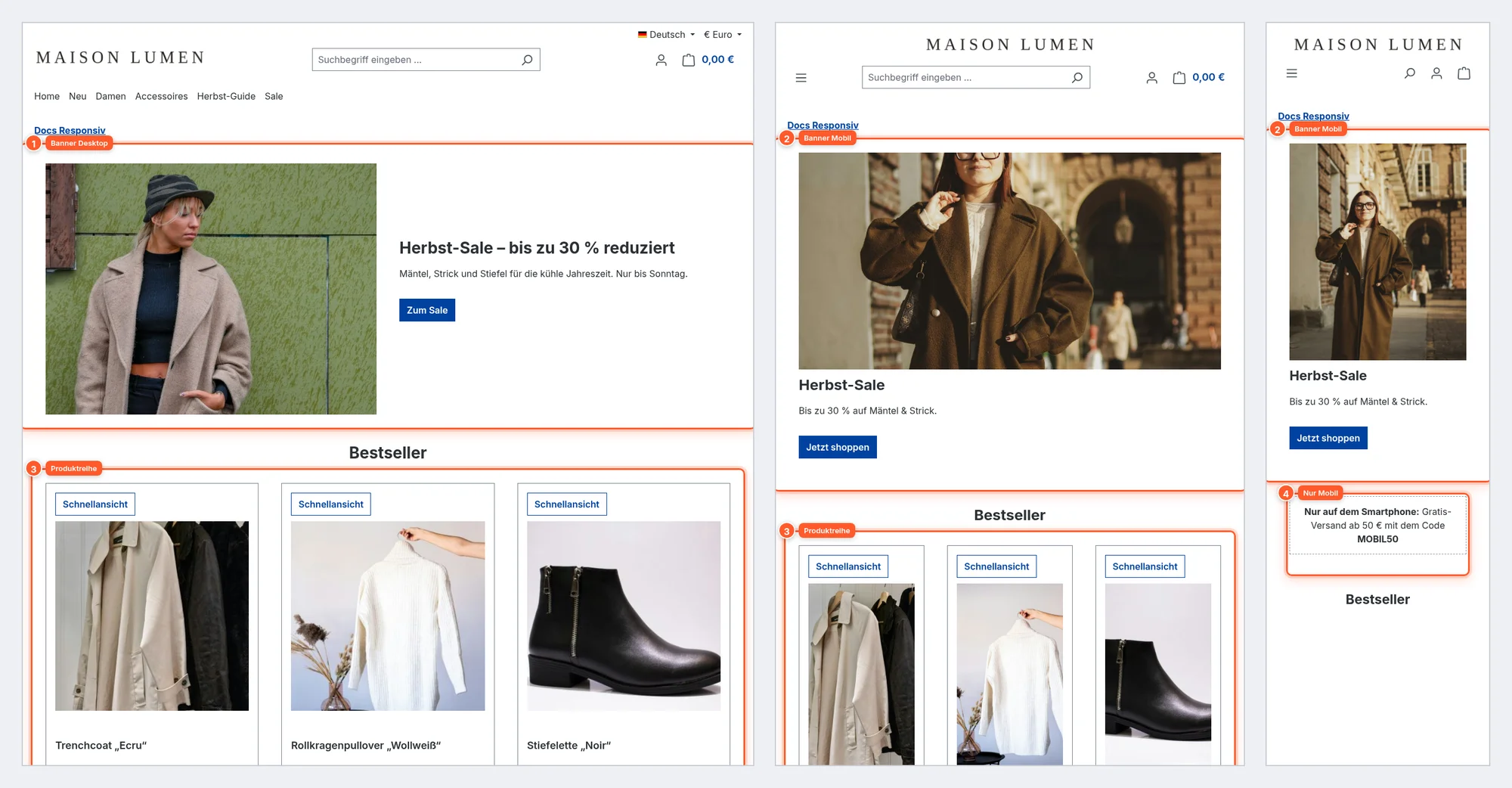
With “Responsive show & hide for Shopping Experiences” you decide for every section and every block of a Shopping Experience on which screen sizes it appears in the shop: Mobile, Tablet, Laptop, Desktop and Large Desktop. For example, you can show a wide landscape banner on large screens and a compact portrait version on smartphones – on the same page, without a second Shopping Experience.
You’ll find the toggles right in the section or block settings in the Shopping Experience editor. The editor also shows you in its device preview what’s hidden on which device.
Setup
- Install and activate the plugin under Extensions › My extensions. No further configuration is needed for showing and hiding.
- Under Content › Shopping Experiences, open the layout you want to adjust.
- Click a section or block. The Responsive Toggles area with five device toggles appears at the bottom of the sidebar.
- Click the devices on which the element should not appear – grayed-out devices are hidden, blue ones are visible.
- Save and check the page in the shop.
New sections and blocks are visible on all devices. The plugin only kicks in once you switch off a toggle – for an element that’s visible everywhere, nothing changes in the shop at all.
Showing and hiding sections
A section usually contains several blocks (e.g. banner, text, products). If you hide the section, everything in it disappears at once – ideal for complete variants of a page (“desktop banner”, “mobile banner”).
- In the editor, click the section icon to the left of the section to open the Section settings 1.
- Scroll down in the sidebar to Responsive Toggles 2 and switch off the devices you want.
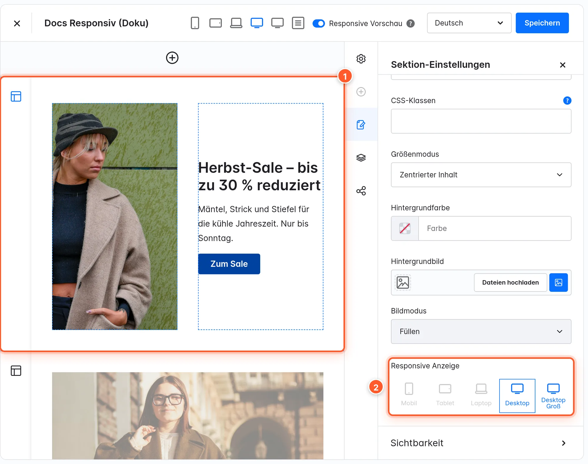
Tip: Give the section a descriptive Name in the section settings (e.g. “Banner Mobile”). With several variants of the same section, this makes it easier to keep track.
Showing and hiding blocks
For finer adjustments within a section, hide individual blocks – such as a product row that looks too cramped on smartphones, or a note that should only appear on mobile.
- Click the block in the editor. The Block settings open in the sidebar 1.
- Under Responsive Toggles 2 switch off the devices on which the block should be missing.
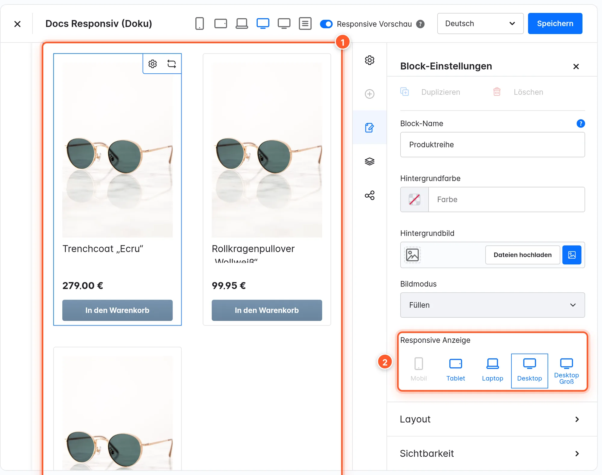
Section and block work together: a block only appears if both its section and the block itself are switched on for the device.
Preview in the editor
The plugin extends the toolbar of the Shopping Experience editor:

- 1 Besides smartphone, tablet and desktop, the Laptop and Large Desktop views are also available – one for each device toggle.
- 2 When Responsive Preview is on (default), sections and blocks you’ve hidden for the selected device view are shown faded and marked with the note “Section is hidden for this device view.” or “Block is hidden for this device view.”.
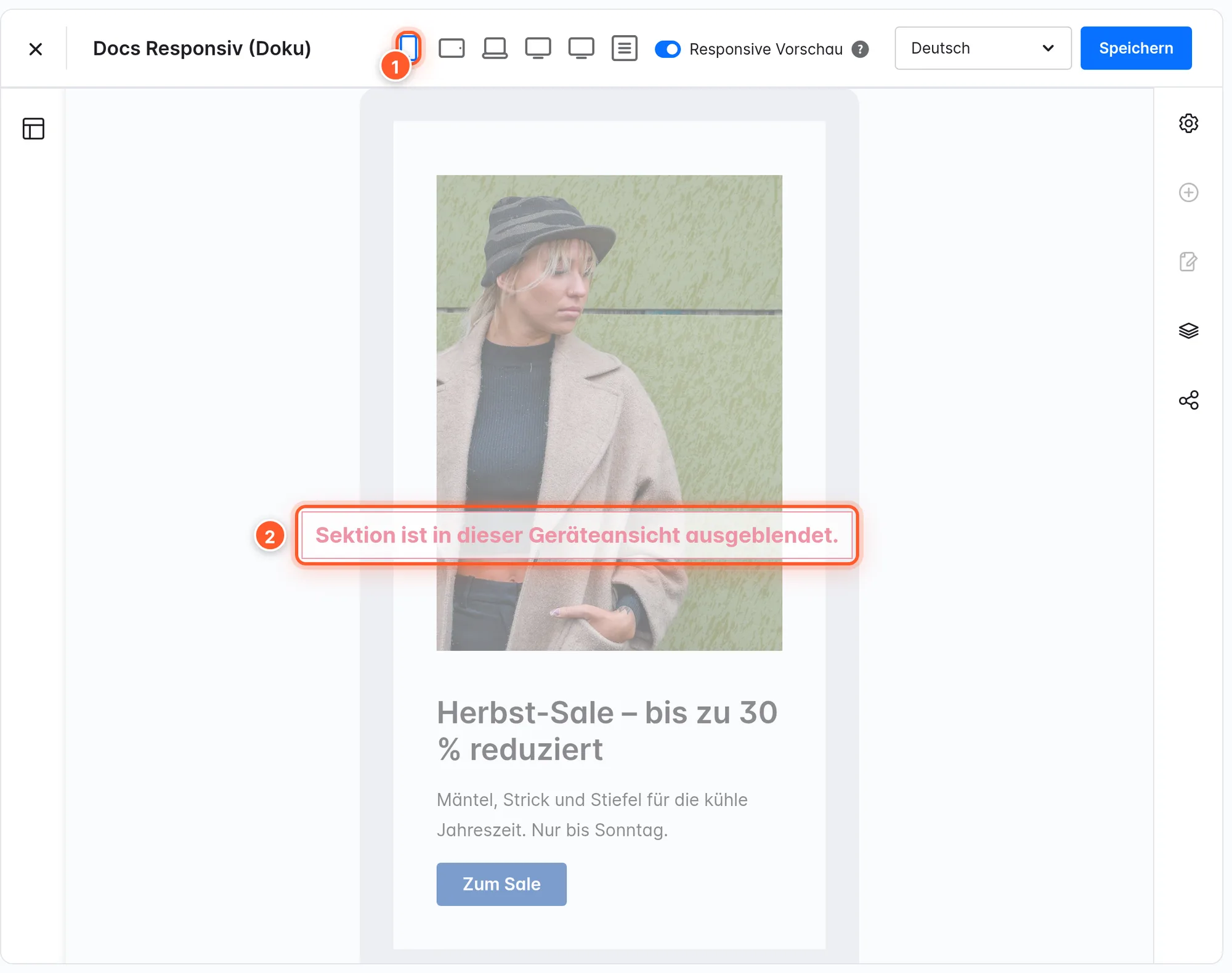
Hidden elements stay editable in the editor – they’re only marked, not removed. Switch off Responsive Preview if you want to see all elements normally regardless of the device view. When you select a section or block, the device of the current preview is also outlined in the device toggles.
Loading content later
By default, hidden elements are only hidden with CSS: they’re still in the page’s HTML, and the browser may load the images of a desktop banner on a smartphone too, for example. With the deferred loading options, you deliver such content only after the page has been built – and only what fits the current screen size.
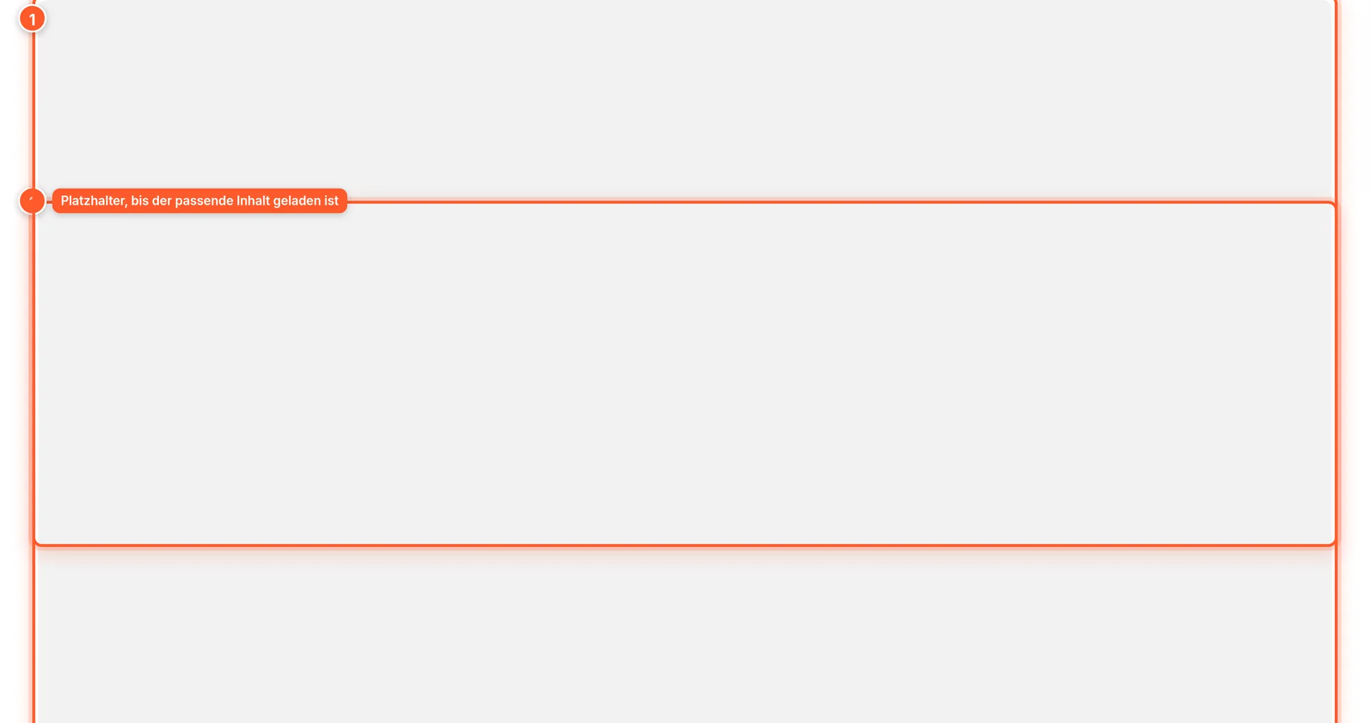
Here’s how it works: on the first load, a gray animated placeholder 1 sits in place of the affected content. As soon as the page has loaded, the plugin uses JavaScript to request the content for the current screen size from the shop and replaces the placeholders. If the browser window is resized across a device boundary, the plugin loads the content for the new size.
Which content is loaded later is controlled in the plugin configuration (see Settings):
| Option | What is loaded later |
|---|---|
| Load content with images after page has loaded | Blocks that contain an image, plus sections with images that use the responsive toggles |
| Load all content that uses the responsive switches after page has loaded | All blocks with at least one device toggle switched off |
| Load all content after page has loaded | All blocks of the Shopping Experience |
Loading later means: the content appears a moment later and only after JavaScript has run. Use the options deliberately for image-heavy pages and check the page in the shop afterwards. Content at the very top of the page (e.g. the main banner) usually doesn’t benefit – the visitor sees the placeholder there first.
Settings
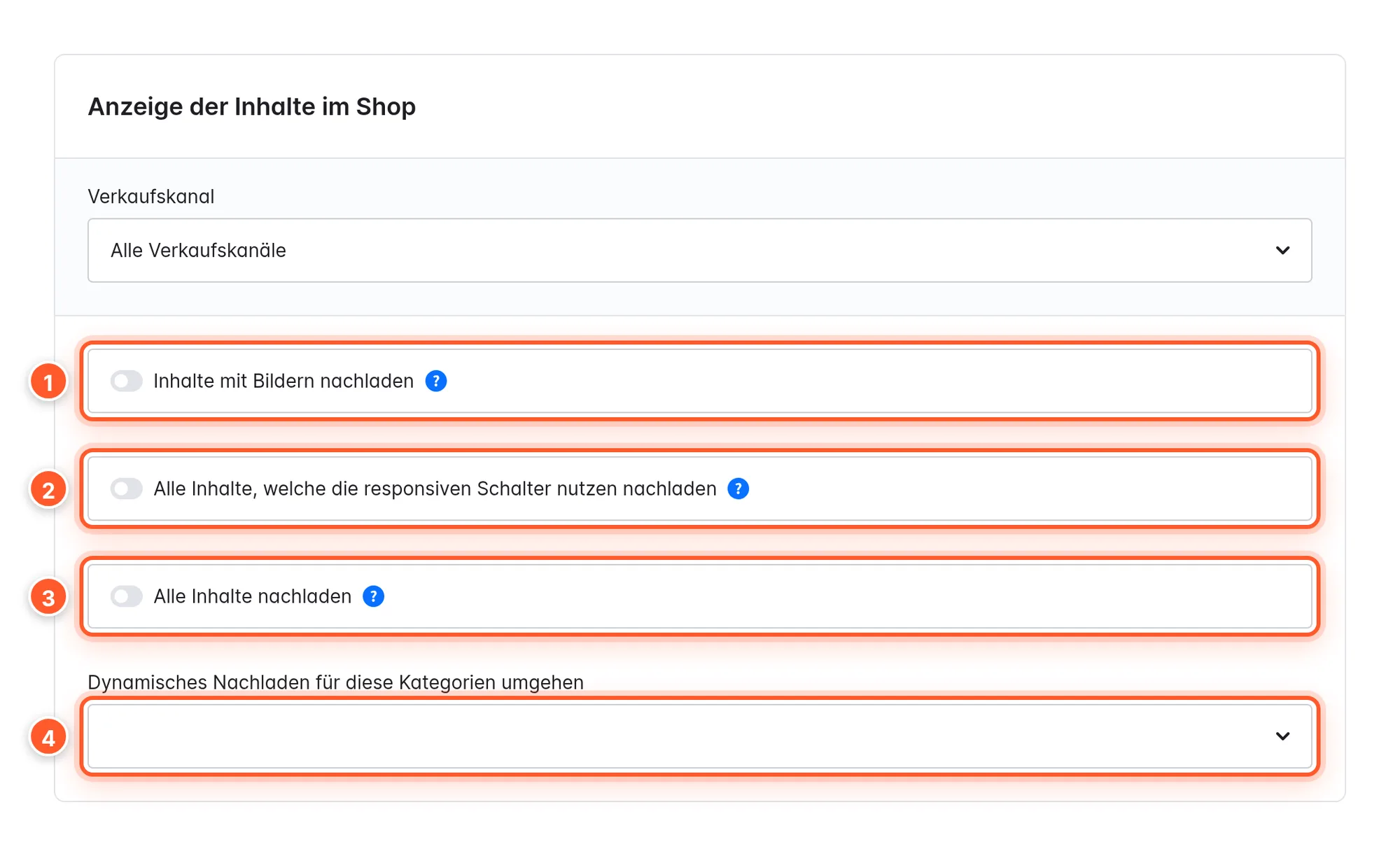
You’ll find the plugin configuration under Extensions › My extensions › Responsive show & hide for Shopping Experiences › Configure. All options are off by default and can be set per sales channel.
Content display in the shop
| Setting | Effect | Default |
|---|---|---|
| 1 Load content with images after page has loaded | Content elements with images that use the responsive toggles are loaded after the page has loaded – the browser doesn’t load unnecessary images. | off |
| 2 Load all content that uses the responsive switches after page has loaded | All blocks with at least one device toggle switched off are loaded later, not just those with images. | off |
| 3 Load all content after page has loaded | All blocks of the Shopping Experience are loaded later, regardless of the toggles. | off |
| 4 Ignore these categories for dynamic loading of content | Categories whose blocks are always delivered directly with the page, even if a deferred loading option is active. | empty |
In the Shopping Experience editor
| Setting | Where | Effect |
|---|---|---|
| Responsive Toggles | Section settings and block settings | Five toggles Mobile, Tablet, Laptop, Desktop, Large Desktop – visible (blue) or hidden (gray) |
| Responsive Preview | Toolbar at the top | Mark hidden elements in the selected device view (default: on) |
Which screen width belongs to which toggle?
The plugin uses the breakpoints of the Shopware default theme (Bootstrap). What counts is the width of the browser window, not the device type:
| Toggle | Window width |
|---|---|
| Mobile | below 576 px |
| Tablet | 576 – 767 px |
| Laptop | 768 – 991 px |
| Desktop | 992 – 1199 px |
| Large Desktop | 1200 px and up |
Tips & hidden features
- Real tablets often end up as “Laptop” or “Desktop”. An iPad in portrait is 768–834 px wide and therefore counts as Laptop, in landscape (1024 px and more) as Desktop. The Tablet toggle only affects narrow windows of 576–767 px (large smartphones in landscape, small tablets). In the comparison image above, the “tablet” is 820 px wide – that’s why the laptop content shows there. Plan your variants by width, not by device name.
- Build variant pairs: Create two sections with different content and toggle them as mirror images (e.g. “Banner Desktop” only Desktop + Large Desktop, “Banner Mobile” only Mobile, Tablet and Laptop). Make sure every device sees exactly one of the two variants.
- Mobile-only notes: A text block that’s only switched on for Mobile works well for notes like “Tap a product …” or app/coupon notes that make no sense on desktop.
- Wide monitors: The Large Desktop toggle applies to all windows from 1200 px – including very wide monitors.
- Works with other Shopping Experience extensions: The toggles sit on sections and blocks, not on specific elements. That’s why they also work for blocks from other extensions.
- Shopware’s own visibility: In the section and block settings, Shopware offers a simple version with three devices under Visibility. The plugin distinguishes five sizes, shows the state in the editor preview and can load hidden content later. Use only one of the two methods per element if possible, otherwise troubleshooting gets hard.
Frequently asked questions
I changed a toggle, but nothing changes in the shop.
Check that you saved the Shopping Experience, and clear the shop cache if needed (Settings › System › Caches & indexes). Also test with the right window width (see the table above) – depending on its width, a tablet counts as Laptop or Desktop.
Do the toggles also work on product pages?
No. On product detail pages (including those with their own Shopping Experience layout for product pages), the plugin doesn’t evaluate the toggles – all sections and blocks are shown there. Use the toggles for category, shop and landing pages.
Is hidden content still loaded?
Without a deferred loading option, yes: hiding happens with CSS, and the content is present in the page’s HTML (that’s no problem for search engines, but may cost loading time for images). Activate Load content with images after page has loaded so images of hidden elements aren’t downloaded unnecessarily.
After activating a deferred loading option, content is missing or appears with a delay.
Loading later needs JavaScript and a request to the shop. Check the page in a normal browser window without a script blocker. If there are problems on a specific page (e.g. with extensions that start their own scripts in Shopping Experiences), add the category under Ignore these categories for dynamic loading of content – the content is then delivered directly again.
The content jumps briefly when I make the browser window smaller.
With a deferred loading option active, the plugin reloads the matching content when a device boundary is crossed and replaces the page content. For normal visitors this practically never happens, but it does when you test on desktop by dragging the window.
What’s the fastest way to test the different sizes?
In the Administration via the five device views in the toolbar with Responsive Preview switched on. In the shop via your browser’s developer tools (device toolbar, e.g. in Chrome with Ctrl + Shift + M) and the widths from the table above.