
Documentation
Jump Markers
Version 3.3.1 · updated November 18, 2026

Overview
With Jump Markers you link straight to a section of the same page: a click on “Knitwear” scrolls smoothly to the knitwear section instead of reloading the page. The plugin comes with two Shopping Experience blocks for this:
- Jump Marker / Page-Internal Reference: the invisible target you place at the start of a section.
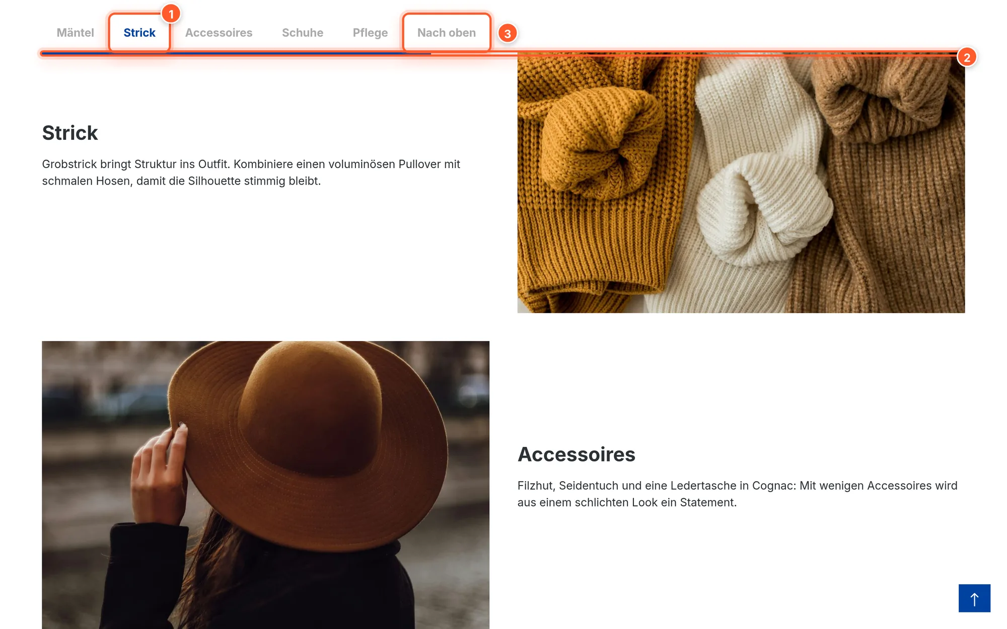
- Jump Marker Navigation: a table of contents built from all jump markers (or headings) on the page, in five styles, optionally scrolling along and with reading progress.
Without a navigation block, the plugin can automatically create a dot navigation at the edge of the page. It takes a scrolling (sticky) header into account on its own: after the jump, the section always lands visibly below the header.
Setup
- Install and activate the plugin under Extensions › My extensions.
- Under Content › Shopping Experiences, open the layout where you want to use jump markers.
- In the right sidebar, switch to Blocks and choose the category 1 FlinkFactory CMS blocks. There you’ll find 2 Jump Marker / Page-Internal Reference and 3 Jump Marker Navigation.
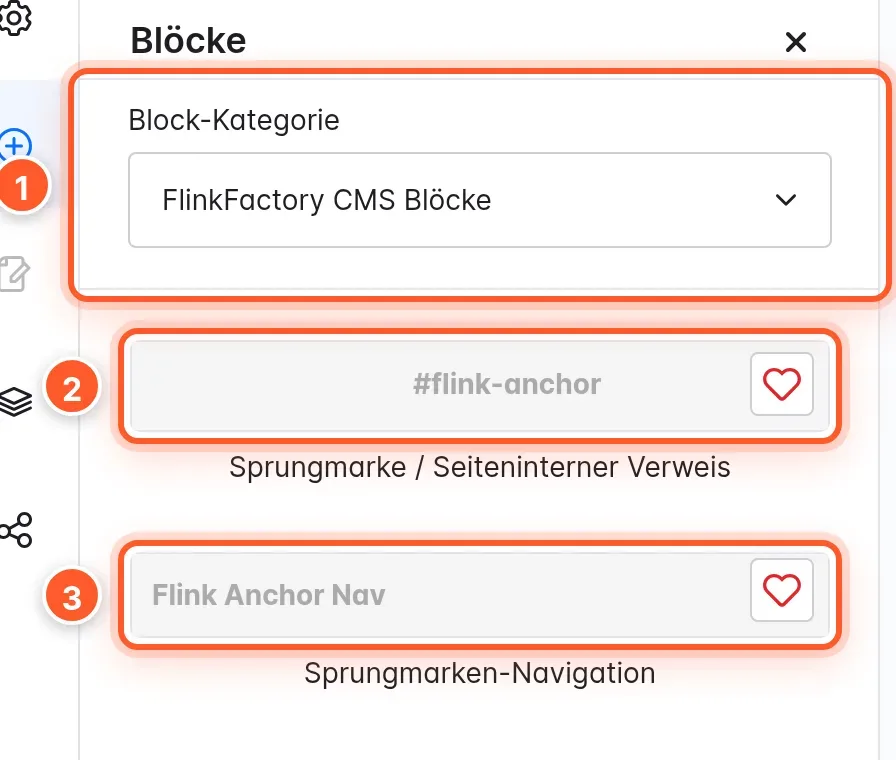
In Shopware, new blocks can only be added in the system’s default language. If the editor is set to a different content language, the block list is grayed out.
- Drag a jump marker directly above each section you want to jump to, and give it a title (see below).
- Optionally, drag a Jump Marker Navigation to the top of the page. It lists all jump markers automatically.
- Save, done.
Setting jump markers
Click the jump marker’s gear icon in the editor to edit it.
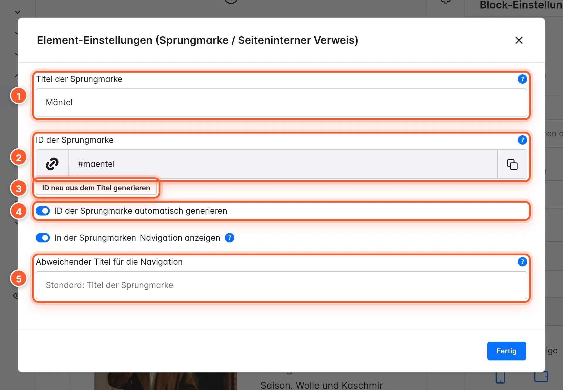
- Jump marker title 1: appears in the navigation and is the basis for the automatic ID.
- Jump marker ID 2: the part after the
#in links, e.g.knitwear. Lowercase letters, numbers, hyphens and underscores are allowed. The ID must be unique on the page. - Generate anchor ID automatically 4: the ID is created from the title and stays stable afterwards, even if you change the title later. That way existing links keep working. If you still want to update it, click Regenerate ID from title 3.
- Show in jump marker navigation: switch it off to hide the jump marker from all navigations. It stays linkable anyway.
- Custom navigation label 5: a shorter text just for the navigation, e.g. “Care” instead of “How to care for wool properly”.
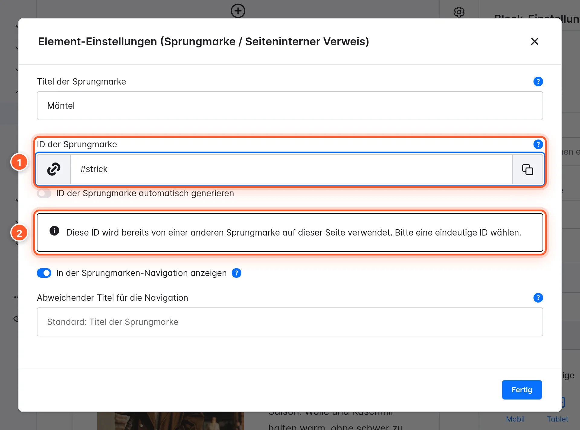
If you use an ID twice, the editor warns you right away:
Linking to a jump marker
As the link target, enter # and the ID, e.g. #knitwear. This works in any link: in the text element, in buttons, in image links and in the menu. From other pages, link with the full address plus ID, e.g. https://your-shop.com/fall-guide/#knitwear. Even then, the visitor lands at the right section below the sticky header.
Jump Marker Navigation
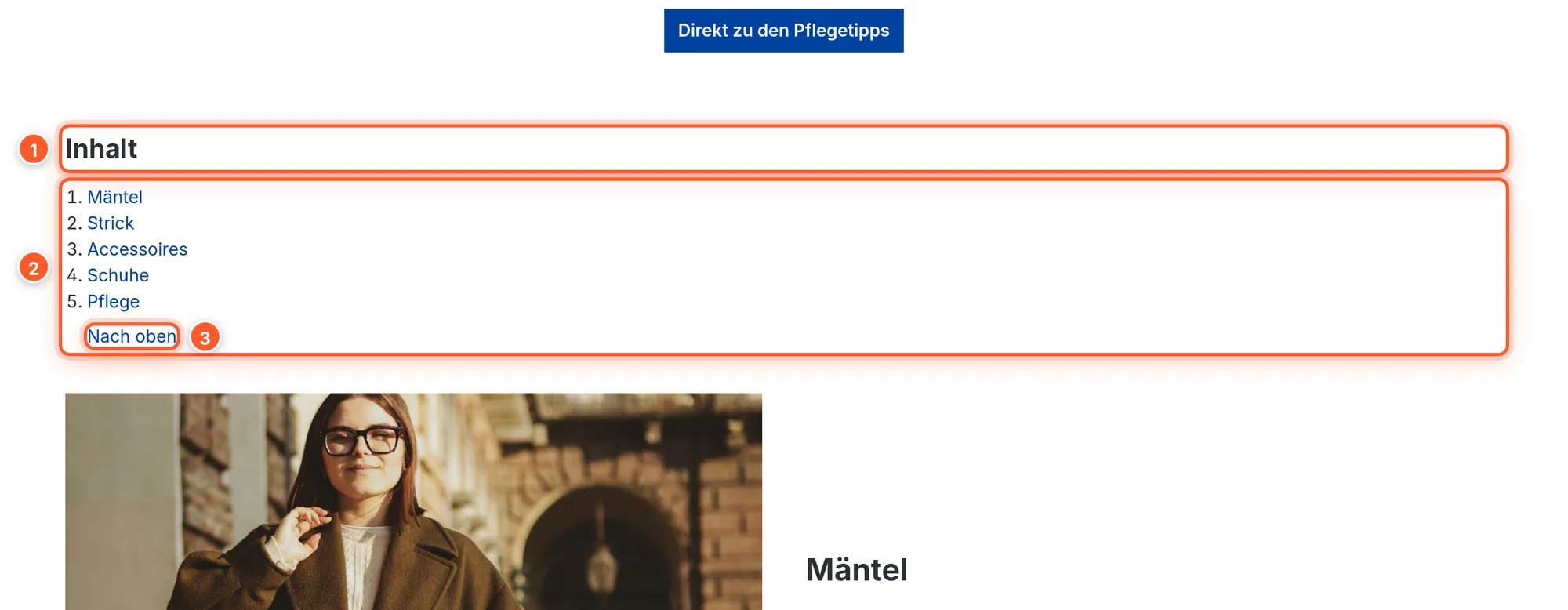
The Jump Marker Navigation block creates a table of contents. In the editor, it shows a preview of the current items.
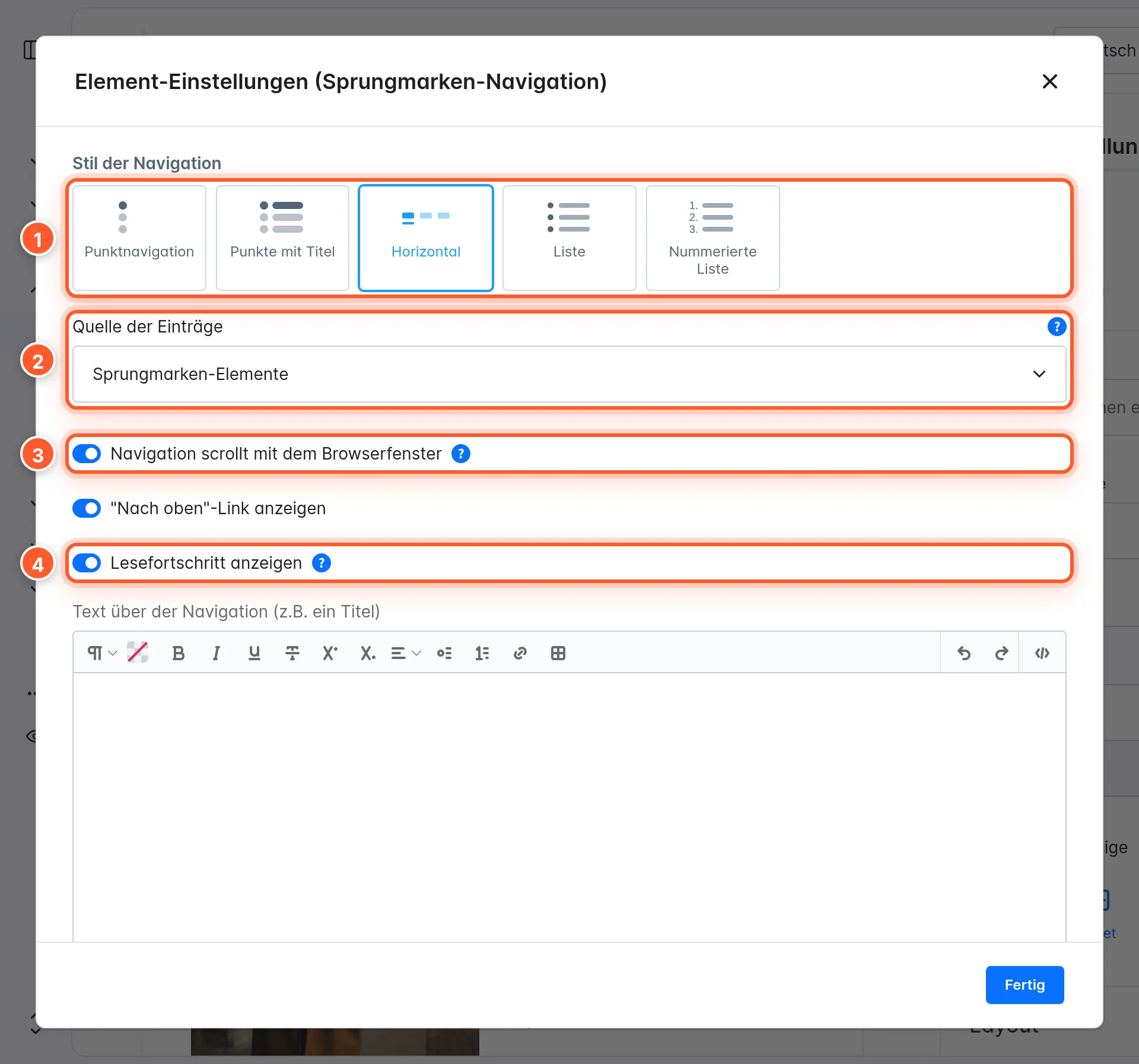
Navigation style 1:
| Style | Display |
|---|---|
| Dot navigation | Dots, title on hover |
| Dots with title | Dots with permanently visible title |
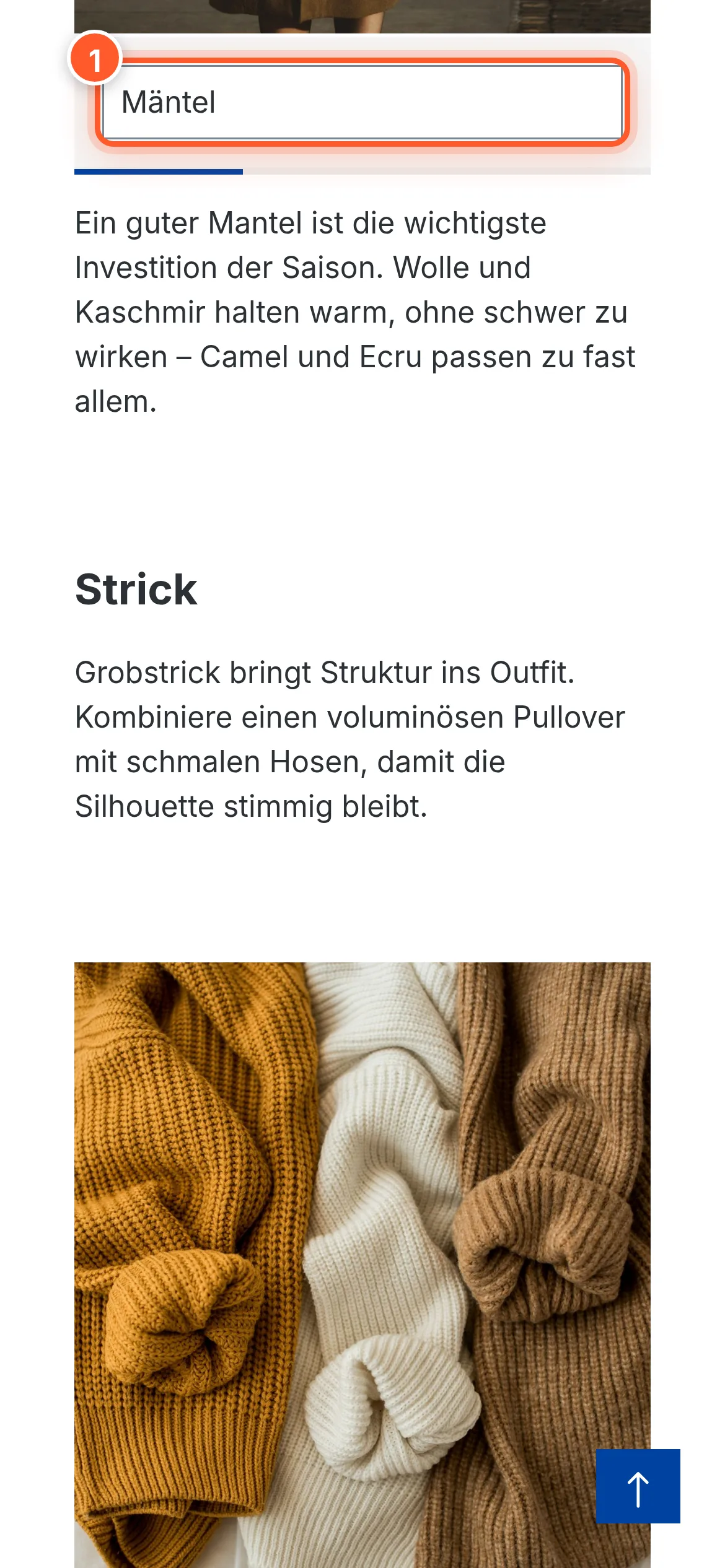
| Horizontal | Bar with items side by side. Arrows appear as soon as not all items fit; the bar can be dragged with the mouse and centers the active item. On mobile devices it turns into a select list. |
| List | Classic table of contents |
| Numbered list | Table of contents with numbers |
More options:
- Item source 2: the page’s Jump marker elements or Page headings. With headings, choose H2 only or H2 and H3 under Included headings. You don’t need any jump marker blocks for this.
- Navigation scrolls with the viewport 3: the navigation stays visible below the header as long as its section is in view.
- Show reading progress 4: a bar below the horizontal navigation that shows the progress on the page.
- Show “back to top” link: adds a link back to the top of the page.
- Dot color: overrides the global dot color for this navigation (dot styles only). The colors come from your theme configuration.
- Text above the navigation (e.g. a title): e.g. “Contents” or “On this page”.
Navigation from headings
For long guides or legal texts, you don’t have to set a single jump marker: set the source to Page headings. The plugin creates the anchors from the H2 (and optionally H3) headings of the text elements.
Mobile
On smartphones, the horizontal navigation turns into a select list that saves space and is easy to use with your thumb.
Dot navigation at the edge of the page
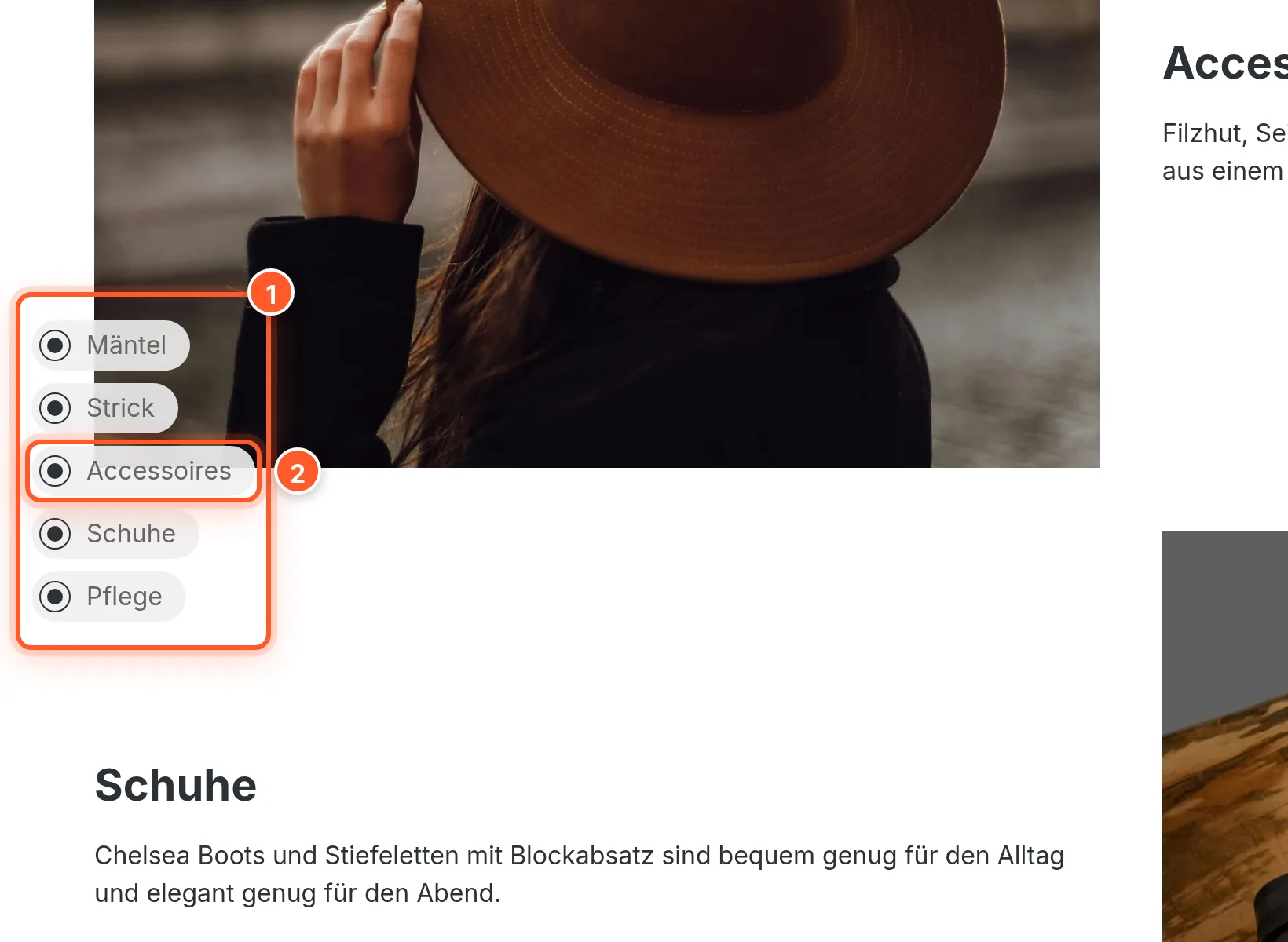
If you don’t want to place a navigation block, switch on Generate a dot navigation from jump markers in the plugin configuration. As soon as a page contains at least two jump markers, a floating dot navigation appears at the edge of the page. If the page contains a visible jump marker navigation, the plugin hides the dots automatically so nothing appears twice.
Settings
Found under Extensions › My extensions › Jump Markers › ⋯ › Configure. As usual, you can pick a sales channel at the top and configure each channel differently.
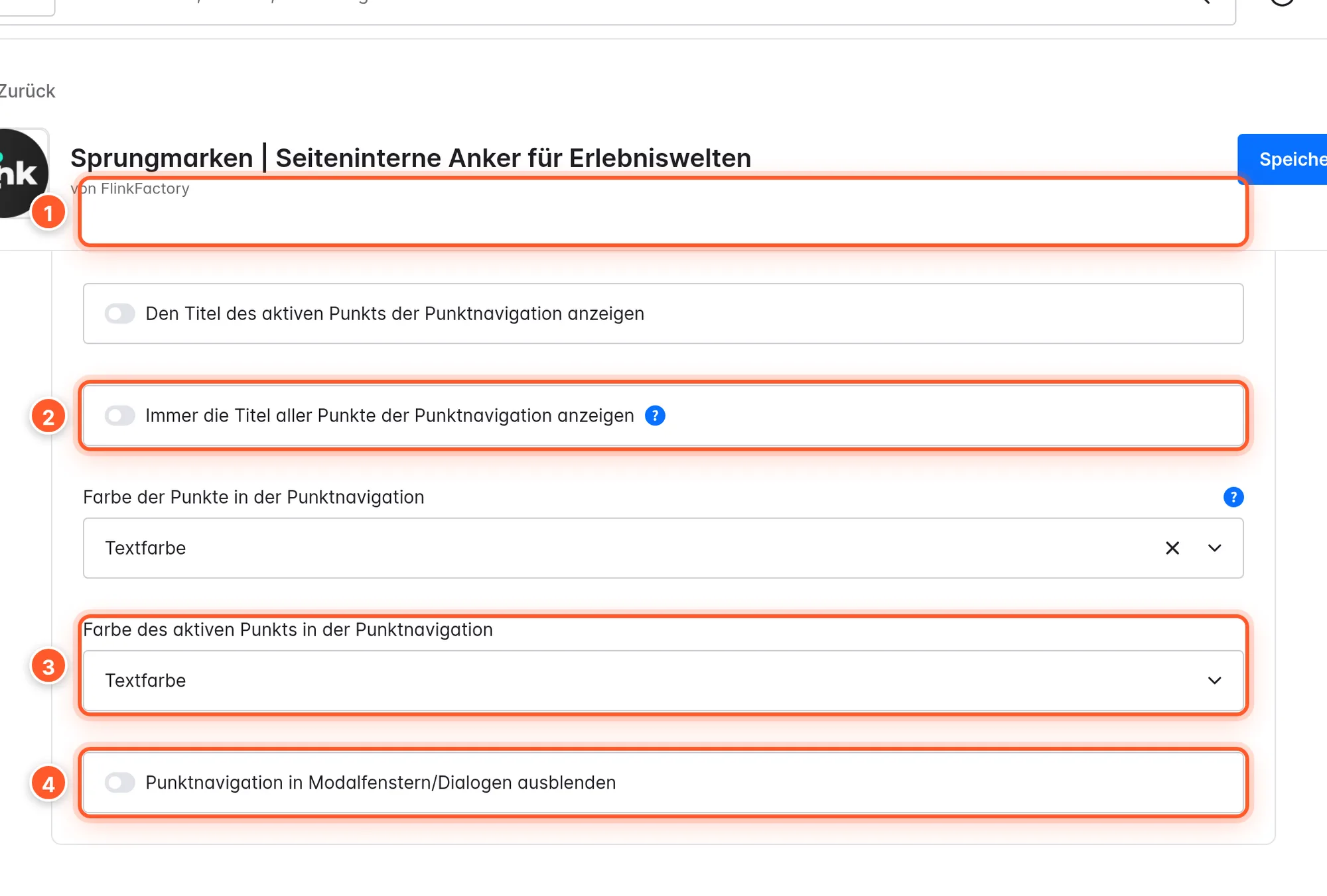
Dot navigation: General
| Setting | Effect | Default |
|---|---|---|
| Generate a dot navigation from jump markers | Floating dot navigation from two jump markers per page. The navigation block works independently of this. | off |
| Always show the title of the active dot | Shows the section title next to the active dot. | off |
| Always show the titles of all dots | All titles permanently visible. | off |
| Color of the dots | Color from the theme (Primary, Secondary, Border, Background, Success, Information, Warning, Danger, Text color, Headline color, Price, Buy button …). | Text color |
| Color of the active dot | Color of the active dot, same choices. | Text color |
| Hide dot navigation in modals/dialogs | Hides the dots while a dialog is open. | off |
Dot navigation: Mobile
| Setting | Effect | Default |
|---|---|---|
| Hide dot navigation on mobile devices | No dots on smartphones. | off |
| Always show the title of the active dot on mobile devices | Title of the active section on mobile too. | off |
| Position of the dot navigation on mobile devices | Top, Middle or Bottom, each Left or Right | Bottom left |
| Size of the dots on mobile devices | Smaller, Normal, Larger (mobile only). | Normal |
Jump markers
| Setting | Effect |
|---|---|
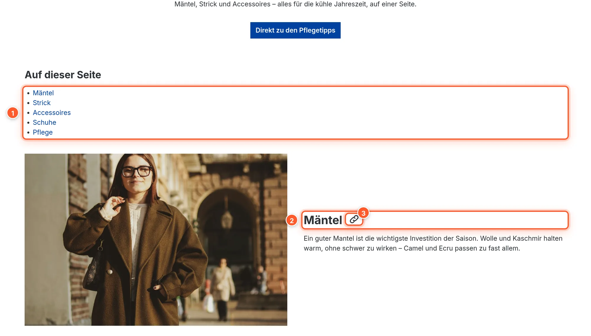
| Show a copy-link button next to visible jump markers | On hover, a small button appears next to visible jump targets (heading anchors and your own anchors) that copies the direct link to the section. |
| CSS selector(s) for additional sticky header elements | Only needed if jump targets disappear behind your theme’s sticky header. The plugin detects fixed elements in the standard header by itself. Separate multiple selectors with commas. |
Tips & hidden features
- Table of contents without jump markers: The Page headings source turns every long text element into a linked table of contents – ideal for FAQ, guide or terms and conditions pages.
- Share deep links: With the copy-link button, visitors (and your support team) copy the link straight to a section in one click.
- Hide a jump marker, keep the link: Switch off Show in jump marker navigation if an anchor is only meant for a button or newsletter link and shouldn’t appear in the table of contents.
- Short navigation titles: Use Custom navigation label so the horizontal bar doesn’t overflow while the heading in the content stays descriptive.
- Stable IDs: Automatically generated IDs don’t change when you edit the title later. Links in newsletters or ads stay valid.
- Direct visits with
#id: The header offset is also taken into account when a URL with#idis opened (e.g. from Google or a newsletter).
Frequently asked questions
After the jump, the header covers the start of the section.
The plugin measures the sticky header’s height automatically, including fixed elements inside it. If your theme uses additional fixed bars outside the standard header, enter their CSS selector under CSS selector(s) for additional sticky header elements, e.g. .my-sticky-bar.
I used to set an “offset from the top edge”. What happens to it?
The value is ignored because the offset is calculated automatically. The editor shows a corresponding note on old jump markers.
The dot navigation doesn’t appear.
Check three things: Generate a dot navigation from jump markers is active, the page contains at least two jump markers, and there’s no visible jump marker navigation block on the page (in that case the dot navigation is hidden on purpose). On smartphones, also check Hide dot navigation on mobile devices.
My #section link doesn’t jump.
The ID in the link has to match the jump marker’s ID exactly, without spaces and in lowercase. In the editor you’ll find the ID in the Jump marker ID field.
Does the navigation also work with Grid Builder Pro or other blocks?
Yes. Jump markers and the navigation are regular Shopping Experience blocks and can be combined with all other blocks. The headings source reads H2/H3 from text elements.
Is the jump marker visible in the shop?
No, the jump marker itself is invisible. Only the navigations are visible and, if enabled, the copy-link button on hover.